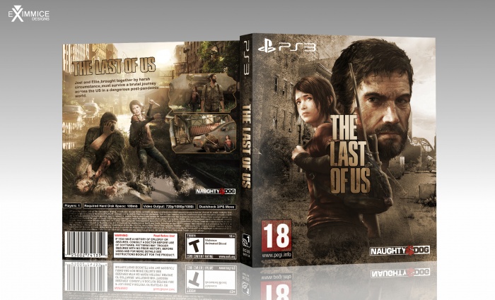
The front is great! Love this look, it's totally unique.
The back is a little bit too plain for me, though, and I don't like the implementation of the text. It's too big, I think. And I miss screenshots.
The rusty brown color scheme is really fitting to the game and the front looks really great, but I've got a few issues with the back of the box.
First, there's the tagline, it isn't necessary to have the title as a header to the synopsis imo. (as it appears on the front and spine already and looks a bit lame to be honest) The ND logo could be moved down a bit, so it's doesn't interfere with the water in the background. Not a big deal, but the ratings don't match up (an ESRB reason on the back and a PAL rating on the front?) There are also a few typos in the synopsis, like a missed space bar and it must be 'circumstances' and 'post-pandemic'.
 The Last of Us Box Cover Comments
Wow . Nice Cover . Amazing Brother
[ Reply ]
very good.
nice work.
[ Reply ]
The front is great! Love this look, it's totally unique.
The back is a little bit too plain for me, though, and I don't like the implementation of the text. It's too big, I think. And I miss screenshots.
[ Reply ]
Love the colour tone.
[ Reply ]
thanks guys :)
[ Reply ]
Nic Job Bro . . . (â—Žoâ—Ž)
[ Reply ]
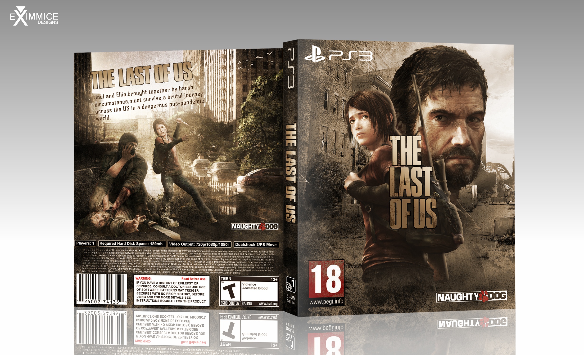
Update and printable!
[ Reply ]
Great! Very nice colour palette.
[ Reply ]
Wow, the screenshot make a huge difference. Looks great now!
[ Reply ]
Amazing
[ Reply ]
Nice work.
[ Reply ]
I can say , Just greattttt , o_O
[ Reply ]
this cover better than the all cover for "The last of us"
very nice..
[ Reply ]
Another TLOU cover with people drooling all over it. Yeah, I'm on VGBA.
No offense to you, you did a good job.
[ Reply ]
My god Martiniii if VGBA would be a Tv Series, you would be it's comic relief.
[ Reply ]
Omg...Thanks all!!:)
[ Reply ]
The rusty brown color scheme is really fitting to the game and the front looks really great, but I've got a few issues with the back of the box.
First, there's the tagline, it isn't necessary to have the title as a header to the synopsis imo. (as it appears on the front and spine already and looks a bit lame to be honest) The ND logo could be moved down a bit, so it's doesn't interfere with the water in the background. Not a big deal, but the ratings don't match up (an ESRB reason on the back and a PAL rating on the front?) There are also a few typos in the synopsis, like a missed space bar and it must be 'circumstances' and 'post-pandemic'.
The design itself is great though, so nice job.
[ Reply ]
I used the oroginal tex:
link
[ Reply ]
@eximmice Okay, but that still doesn't correct the typo's :/ and the non-matching ratings on your box, don't look that way on the original print?
[ Reply ]
@Bastart omg....u right...o.O i will correct
[ Reply ]
love it!
[ Reply ]
Love the color.
[ Reply ]
Am I the only one who finds joel a little too big on the front? I mean he looks like a floating head :l You just cant take the box seriously.
[ Reply ]
awsome cover just like game
[ Reply ]
Congrats Brother
[ Reply ]
Congrats . . .
[ Reply ]
Congrats, That's well deserved.
[ Reply ]
Thx again guys! :):)
[ Reply ]
This is excellent. But, yeah, the ESRB/PEGI mis-match needs fixing.
[ Reply ]
Next time ;)
[ Reply ]
I love this box so much
[ Reply ]