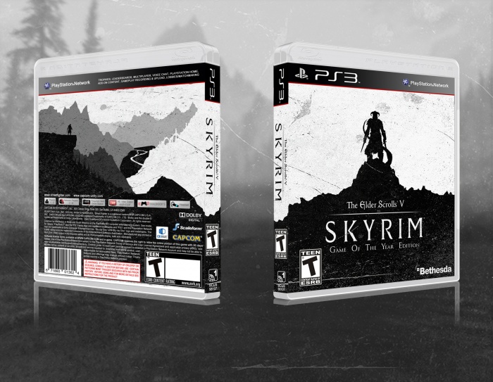
I wanted to go for something simple for this one. The idea was that the front image would almost be connected to the back, although its hard to see in the way i have presented it. The reason there is no description on the back is because, i felt the picture was too good to go over. Plus it was hard to find text that stood out due to the changing shades of the picture. I guess you could say that its game of the year edition so, its different from the original...
 The Elder Scrolls V: Skyrim Box Cover Comments
Comment on Matknapers18's The Elder Scrolls V: Skyrim Box Art / Cover.
A really really really cool idea. The back is far too empty though, you should implement at least a little text. It's not hard, make it black and put it top right or make it white and but it bottom left.
[ Reply ]
Thanks! And yeah i did try adding text over the black on the left, but it didn't look quite right to me. But thats, me and for strange reason whenever i add text i end up hating it.Which is stupid really, and your'e right i do need to work on it.
[ Reply ]
@Matknapers18 I think it's the matter of finding the right font. I would suggest something in the serif family (the font with the little decorative details in it's corners) to balance out the non-serif logo.
You don't even have to do a large chunk of text. You can literally put a line or two of critic reviews with the little star ratings if you like.
[ Reply ]
@lucidhalos Thankyou this is extremely helpful!
[ Reply ]
Present it in 2D, take the ESRB ratings off the spine (they should only be on the front and back) and put info into the ESRB on the back.
[ Reply ]
link Dont you think the boxes are a bit too similar? I mean the back of your box is exactly the same as reed's front.
[ Reply ]
Exactly? No. Similar? Yes.
[ Reply ]
And this looks ten times better than what reed did. No offense, reed.
[ Reply ]
I mean, i can see the resemblance, but ive never even seen this piece of work before. If you are accusing me of copying him that is certainly not the case. Before i started i knew that back would have that picture, and would also be in the same style as the front. So its just a coincidence, i swear
[ Reply ]
It's similar, but not an exact copy and this is executed with far better taste, imo.
Anyway, not to litter this boxart with a bunch of my comments...
@Matknapers18 I really like this box art and the simplicity. The grungy texture you chose was a nice call. The only thing it's missing is some text (as said in the comment way at the top) and that ESRB logo is no necessary on the spine of the box.
[ Reply ]
what box cover program did you use?
[ Reply ]
I just used Gimp
[ Reply ]
Nice
[ Reply ]
this is perfect! too many designers on this site don't appreciate minimalism that is done right. you are definitely a role model for my future work. hell i'd be one of the few that says get rid of all the text but the title on the front and spine. let your art speak for itself when it's strong enough
[ Reply ]
wow, thank you. I completely agree, minimalism is beautiful, and under appreciated on this site. I look forward to seeing some of your work!
[ Reply ]