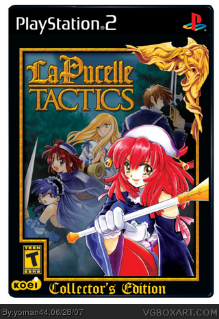
[ Box updated on June 28th, 2007 ] [ original ]
 La Pucelle: Tactics Collector's Edition Box Cover Comments
Comment on [Deleted]'s La Pucelle: Tactics Collector's Edition Box Art / Cover.
I hope you like it
[ Reply ]
It looks so genuine..I am giving it a 5/5 and a favorite.
But add an S to Collector Edition
[ Reply ]
#2, Oh, yes thank you dude ^^
I have updated with your council.
Edited at 1 decade ago
[ Reply ]
I like how you colored the teen logo..
[ Reply ]
Does Reed can change the name of this box and add an "S" next to "Collector" ?
[ Reply ]
He should..
[ Reply ]
dont bug him it doesnt really matter
[ Reply ]
#7, lol yes I think
[ Reply ]
#4, Thank you but it was not very hard...
[ Reply ]
0/0 this is pratically the official boxart with the collectors edition... dont do that again...
[ Reply ]
#10, Are sure it official ? Do you have a link ?
[ Reply ]
link
The only reason I think it's not the official is the mastiff logo is gone and the frame is wider. So I think it's just the same art as the box; a coincidence. Still, 4/5
[ Reply ]
#12, I'm not living in USA you know...
[ Reply ]
#12, you can see its exactly like it, it doesnt matter if it was a coincidence because its exactly like it, he just added the collectors edition and put the teen logo yellow( witch doesnt look good by the way) and im not wanting to pick a fight here or anything but even though you dont like in USA you do have access to USAs boxarts... you can just look them up in the internet
[ Reply ]
It was looks great, but if it's just an improving official boxart...
Edited at 1 decade ago
[ Reply ]