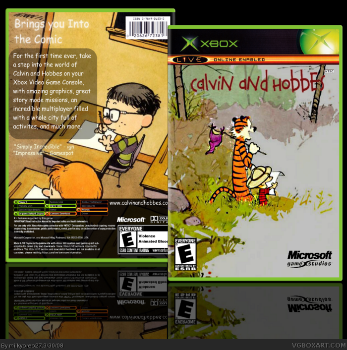
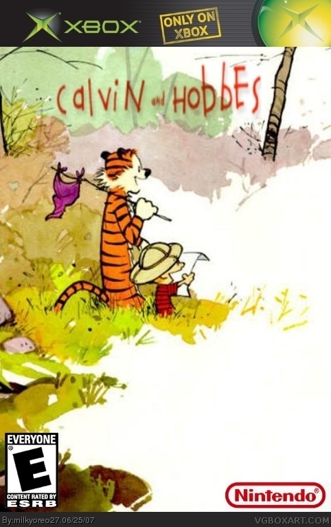
[ Buy Calvin and H... at Amazon ] By milkyoreo27 27 on June 25th, 2007 No Printable Available [ Box updated on March 30th, 2008 ] [ original ] Calvin and Hobbes Box Cover Comments Comment on milkyoreo27's Calvin and Hobbes Box Art / Cover. Cancel Reply Ranmakuu 15 [ 1 decade ago ] Bad just bad 0/5 -Too Strech Out -Why Is There A Nintendo Logo On A Xbox Game? It's still a 0/5 [ Reply ] omardathug199 1 [ 1 decade ago ] Are you 5 years old or something? And Nintendo is not for Xbox.You have got to delete this. [ Reply ] xForkBoy 9 [ 1 decade ago ] Don't flame him guys, this site is for unofficial boxes... so who cares what developer is on what box? I like it man ^^b these were funny comic strips, it'd be a pretty silly game. Edited at 1 decade ago [ Reply ] milkyoreo27 27 [ 1 decade ago ] thanks xForkBoy glad u like it guys, i know about the Nintendo thing, but look at what xForkBoy said [ Reply ] xForkBoy 9 [ 1 decade ago ] #4, No problem man, us Calvin & Hobbes fans gotta stick together =D [ Reply ] Ayron 47 [ 1 decade ago ] is this like a Halo 3 and SD! vs Raw 'stick together ' thing. i don't like it. the empty white spaces bother me in some way, and the dev logo's aren't too good either. nice try though. 3.5/5 [ Reply ] ELCrazy 50 [ 1 decade ago ] It's cute, actually. 3/5. [ Reply ] lord_arcanus 20 [ 1 decade ago ] #1, it's not as bad as your crap. [ Reply ] Ghettoshark 8 [ 1 decade ago ] Let's see: Box itself 1/5 Calvin and Hobbes 5/5 Overall 3/5 [ Reply ] werdney 5 [ 1 decade ago ] Calvin and Hobbes is great, but the box isn't good at all. It's too long and shouldn't have a nintendo logo. Also the logo's kinda blurry. 2/5 [ Reply ] retro704 1 [ 1 decade ago ] what would u do? [ Reply ] ephran 1 [ 1 decade ago ] i like it i think people are a little to hypercritical of the nintendo logo anyways gj 3.5/5 [ Reply ] i like pie 1 [ 1 decade ago ] great! this would be a cool game. Edited at 1 decade ago [ Reply ] theredlight 20 [ 1 decade ago ] make the back calvin [ Reply ] Echeron 1 [ 1 decade ago ] Best I've seen so far, actually. If only it was so. [ Reply ] zorfog 1 [ 1 decade ago ] i dont see the nintendo symbol... where is it? [ Reply ] zorfog 1 [ 1 decade ago ] also awesome, +fav :D [ Reply ]
 Calvin and Hobbes Box Cover Comments
Bad just bad 0/5
-Too Strech Out
-Why Is There A Nintendo Logo On A Xbox Game?
It's still a 0/5
[ Reply ]
Are you 5 years old or something? And Nintendo is not for Xbox.You have got to delete this.
[ Reply ]
Don't flame him guys, this site is for unofficial boxes... so who cares what developer is on what box?
I like it man ^^b these were funny comic strips, it'd be a pretty silly game.
Edited at 1 decade ago
[ Reply ]
thanks xForkBoy
glad u like it
guys, i know about the Nintendo thing, but look at what xForkBoy said
[ Reply ]
#4, No problem man, us Calvin & Hobbes fans gotta stick together =D
[ Reply ]
is this like a Halo 3 and SD! vs Raw 'stick together ' thing.
i don't like it.
the empty white spaces bother me in some way, and the dev logo's aren't too good either.
nice try though.
3.5/5
[ Reply ]
It's cute, actually.
3/5.
[ Reply ]
#1, it's not as bad as your crap.
[ Reply ]
Let's see:
Box itself 1/5
Calvin and Hobbes 5/5
Overall 3/5
[ Reply ]
Calvin and Hobbes is great, but the box isn't good at all. It's too long and shouldn't have a nintendo logo. Also the logo's kinda blurry. 2/5
[ Reply ]
what would u do?
[ Reply ]
i like it i think people are a little to hypercritical of the nintendo logo anyways gj 3.5/5
[ Reply ]
great! this would be a cool game.
Edited at 1 decade ago
[ Reply ]
make the back calvin
[ Reply ]
Best I've seen so far, actually. If only it was so.
[ Reply ]
i dont see the nintendo symbol... where is it?
[ Reply ]
also awesome, +fav :D
[ Reply ]