[ Buy Metroid Prim... at Amazon ] By Brettska99 45 on June 25th, 2007 No Printable Available Metroid Prime 3: Corruption Box Cover Comments Comment on Brettska99's Metroid Prime 3: Corruption Box Art / Cover. Cancel Reply Brettska99 45 [ 1 decade ago ] My metroid prime 3 box, enjoy!!! and i think i did a better job on the disc [ Reply ] finalfantaseer22 43 [ 1 decade ago ] don't wii discs just have a textured monotone design? [ Reply ] Brettska99 45 [ 1 decade ago ] #2, yeah but i don't kbow how to do that [ Reply ] E_G 39 [ 1 decade ago ] Brettska99 this box isn't bad, but most of the time I don't like grey backgrounds for the front of boxes, like here. [ Reply ] IceFox 42 [ 1 decade ago ] Though I think it would make a great collector's edition box or something. I love it. 4.7/5 (the blue on the wii template sides is annoying) [ Reply ] Brettska99 45 [ 1 decade ago ] #5, it kinda does look like like a collector's edition doesn't it [ Reply ] WickedGamer1 37 [ 1 decade ago ] nah, samus sticks out way too much from the background. that and the logo overlapping the template like it does is a no.no. plus no spine logo. sorry. but at least you remembered the Teen rating! >.> needs work. could be sweet though. [ Reply ]
 Metroid Prime 3: Corruption Box Cover Comments
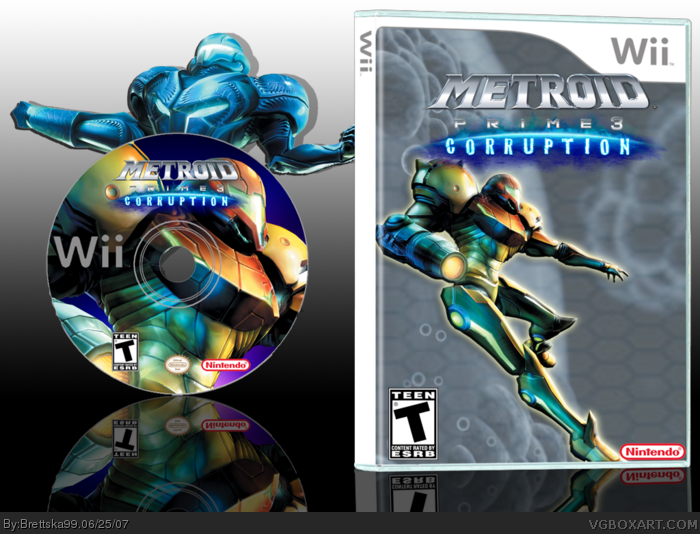
My metroid prime 3 box, enjoy!!! and i think i did a better job on the disc
[ Reply ]
don't wii discs just have a textured monotone design?
[ Reply ]
#2, yeah but i don't kbow how to do that
[ Reply ]
Brettska99 this box isn't bad, but most of the time I don't like grey backgrounds for the front of boxes, like here.
[ Reply ]
Though I think it would make a great collector's edition box or something.
I love it. 4.7/5 (the blue on the wii template sides is annoying)
[ Reply ]
#5, it kinda does look like like a collector's edition doesn't it
[ Reply ]
nah, samus sticks out way too much from the background.
that and the logo overlapping the template like it does is a no.no.
plus no spine logo. sorry. but at least you remembered the Teen rating!
>.>
needs work. could be sweet though.
[ Reply ]