yeah, very intense indeed, i just wanted as many characters as possible, without it being the normal Mario strikers box, with the mario with the glow, you know?
-edit- thanks for comment btw,XD
hey very nice box. but the esrb logo is to high up and mario should be further down, and not covered by the logo. also yoshi should be bit further down. 4/5
 Mario Strikers Charged Box Cover Comments
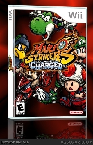
My Mario strikers:Charged box.
comments are[ as always ] appreciated.
[ Reply ]
wow, looks pretty intense. very good though. the #D effect isnt so great though.
[ Reply ]
yeah, very intense indeed, i just wanted as many characters as possible, without it being the normal Mario strikers box, with the mario with the glow, you know?
-edit- thanks for comment btw,XD
Edited at 1 decade ago
[ Reply ]
This is nice, but the logo is a bit lost.
[ Reply ]
updated with bigger logo/ ball deleted.
[ Reply ]
the images are over the white glow on, and there is white on the side from where you didn't cut the images right.
[ Reply ]
hey very nice box. but the esrb logo is to high up and mario should be further down, and not covered by the logo. also yoshi should be bit further down. 4/5
Edited at 1 decade ago
[ Reply ]
very good. The left guy (the yellow one) is a bit off. I would give this a 4 and a half/5
[ Reply ]
Very nice box. Nice colors, nice style. I like it
4,5 / 5
[ Reply ]
thanks alot, i'll fix as much as possible and update.
Edited at 1 decade ago
[ Reply ]
nice box mate, but the koopa (i think) on the left should be a bit higher, so he isnt covered by the title.
[ Reply ]
thanks dude, as i said, i'll update asap. =]
[ Reply ]
Updated!i've followed comments as much as possible.
[ Reply ]
I love how the Mario Strickers art/boxes look.
And i really like this one.
[ Reply ]