i made this box yonks ago....i thought i'd post it up because it's not Final Fantasy. Credit to Shady for 3D and I forget the one for the 2D...
let me know wat you think
XD
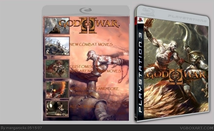
Well, the front isn't too bad but its only a wallpaper.. You need to add a age rating to the front and a dev logo. For the back give the text a bit of a drop shadow so its more easier to see.
Make sure that the screenshot associate with the text eg All New Magic - buts wheres the magic?
You need to add the bottom of the back cover which shows trademark, how many players, how much memory etc.
Yeah you're missing the developer's/publisher's logos, the copyright info, the text on the spine, the PlayStation 3 information boxes that go on the back and the rating etcetera. The biggest problem with not just this box but a lot of your work, is that you get the design but you don't seem to finish the boxes themselves.
the two sides of the template are different. one is blu-ray, and the other is the ps3 blu-ray. the back is waaay too plain and you cant read the text good. the title of the game also shouldnt be on the back.
 God of War 2 Box Cover Comments
i made this box yonks ago....i thought i'd post it up because it's not Final Fantasy. Credit to Shady for 3D and I forget the one for the 2D...
let me know wat you think
XD
[ Reply ]
Well, the front isn't too bad but its only a wallpaper.. You need to add a age rating to the front and a dev logo. For the back give the text a bit of a drop shadow so its more easier to see.
Make sure that the screenshot associate with the text eg All New Magic - buts wheres the magic?
You need to add the bottom of the back cover which shows trademark, how many players, how much memory etc.
If you do these it sure to be a better box!
[ Reply ]
Yeah you're missing the developer's/publisher's logos, the copyright info, the text on the spine, the PlayStation 3 information boxes that go on the back and the rating etcetera. The biggest problem with not just this box but a lot of your work, is that you get the design but you don't seem to finish the boxes themselves.
[ Reply ]
#3, thank you, but like I said this is really old, and I only found it on my friends memory stick today so I wont be able to edit it for a while
:)
[ Reply ]
i agree with #2 and #3, plus the cover artwork is kinda overused a bit.
you're getting better, keep up the good work.
[ Reply ]
make the Grey background smaller.
[ Reply ]
the two sides of the template are different. one is blu-ray, and the other is the ps3 blu-ray. the back is waaay too plain and you cant read the text good. the title of the game also shouldnt be on the back.
[ Reply ]
NEW COMBAT MOVES! lol. What in the name of hell was I thinking?
[ Reply ]