theres just something i don't like about this box, anyways you have to get this game on the DS its the best pokemon game on the entire planet, i don't remember the person who made the temp but i give credit, tell me so i can be sure to properly give credit
I really like the front dude, good job, my only problem is that the logo isn't good, Diamond and Pearl aren't cut out to well "Pokemon" has a few cutting flaws to. the back isn't too good and could use a lot of changes. but you're definitely improving :D . your score is somewhere in between 3.5/5 and 4/5 I can't decide :/
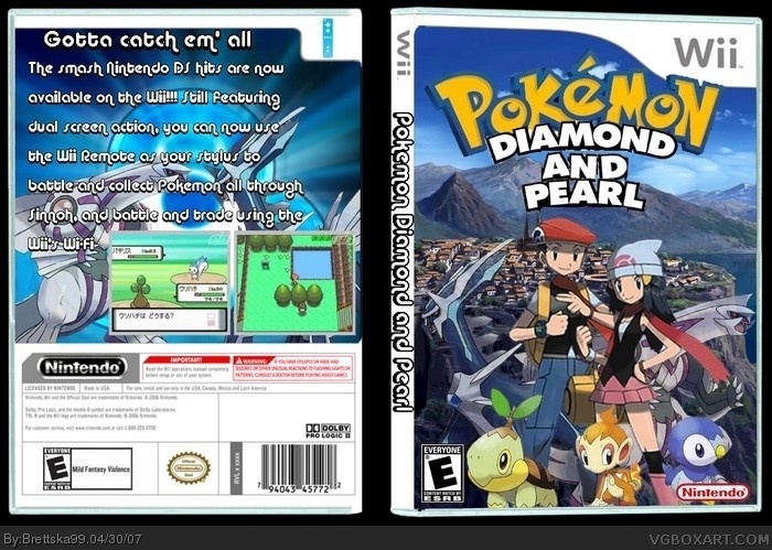
#2, yeah i knew the diamond and pearl logo looked weird, i had to cut it outr from the official box and and is the weirdest looking part cause i had to make that
#6, Putting a console's exclusive games on another console does not make the box funny, it makes the box look like crap and it makes the artist look like a troll.
The front is nice. there are a few cutting errors that are minuscule but the thing that kills it is the back and the spine.
1) the temp. is 3D though your text is 2D. They contradict eachother, and from the outside world would look like a newb who was trying hard.
2)I think everybody be trippin bout the text on the back... it doesnt matter what you wrote brettska, its just that if it's gonna be b.s. than dont make it so noticeable. Also instead of japanese i think english would be the better option. The screenshots are too close and there is a sense for more... also the esrb on the back; where it says mild fantasy violence. you should have each word on its own line to fill in space and make it more pro. will all that said, due to the stunning front, i give 3.8/5
 Pokemon Diamond and Pearl Box Cover Comments
theres just something i don't like about this box, anyways you have to get this game on the DS its the best pokemon game on the entire planet, i don't remember the person who made the temp but i give credit, tell me so i can be sure to properly give credit
[ Reply ]
I really like the front dude, good job, my only problem is that the logo isn't good, Diamond and Pearl aren't cut out to well "Pokemon" has a few cutting flaws to. the back isn't too good and could use a lot of changes. but you're definitely improving :D . your score is somewhere in between 3.5/5 and 4/5 I can't decide :/
[ Reply ]
#2, yeah i knew the diamond and pearl logo looked weird, i had to cut it outr from the official box and and is the weirdest looking part cause i had to make that
[ Reply ]
The wording on the back is off 'the smash nintendo ds hits..'
and the japanese screen shots could be replaced with some nice new english ones..
The 'Version text' is also very easy to make in any word processor that supports word art..
[ Reply ]
#4, its suppose to smash hits beacuse its 2 games not 1
[ Reply ]
Make this on PS3 instead or Xbox 360 to make it funnier
[ Reply ]
#6, its not suppose to be funny
[ Reply ]
#6, Putting a console's exclusive games on another console does not make the box funny, it makes the box look like crap and it makes the artist look like a troll.
[ Reply ]
The front is nice. there are a few cutting errors that are minuscule but the thing that kills it is the back and the spine.
1) the temp. is 3D though your text is 2D. They contradict eachother, and from the outside world would look like a newb who was trying hard.
2)I think everybody be trippin bout the text on the back... it doesnt matter what you wrote brettska, its just that if it's gonna be b.s. than dont make it so noticeable. Also instead of japanese i think english would be the better option. The screenshots are too close and there is a sense for more... also the esrb on the back; where it says mild fantasy violence. you should have each word on its own line to fill in space and make it more pro. will all that said, due to the stunning front, i give 3.8/5
[ Reply ]
wow, you really flunked on this one. the text looks wierd and you should have had a better font that fits the pokemon style 2.5/5
[ Reply ]
I GIVE U A 10/5 ITS AWSOME DONT LISTEN TO OTHER PEOPLE
[ Reply ]
Looks a little dull for being a Wii game, but look at Wario Land: Shake!
Good job.
[ Reply ]