![]() »
»
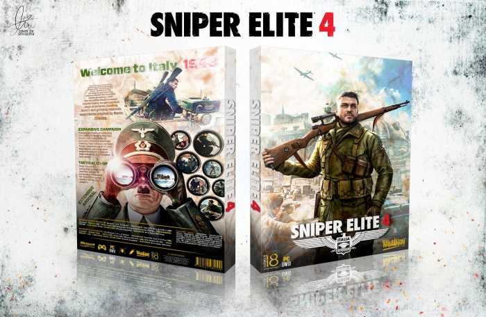
Please See Full Size : 3500*2188 | Feedback is appreciated and thanks for viewing.
Logo : link
Render : link
 Sniper Elite 4 Box Cover Comments
Comment on shiraziha's Sniper Elite 4 Box Art / Cover.
Well done bro . . .
[ Reply ]
ty matin ;)
[ Reply ]
Good one
[ Reply ]
ty iman ;)
[ Reply ]
I like what you did with the screenshots on the back, but I feel like that first paragraph doesn't mesh well with everything else going on. Have you considered cutting back the length of some of your text? I've noticed sometimes there is way too much, which causes your backs to look really busy in contrast to everything else. Your fronts are generally really nice and clean.
[ Reply ]
this is very cool. Can you add printable?
[ Reply ]
ty all for comment ;)
[ Reply ]
Hats off to the colour combinations
[ Reply ]
ty brother ;)
[ Reply ]
like DaRi
[ Reply ]
ty ;)
[ Reply ]
your works are amazing!!! where can i download printable versions of your boxes?
[ Reply ]
send pm in forum
[ Reply ]
Awesome
[ Reply ]
Where are you man?
[ Reply ]
Congrats bro for 50 level....
[ Reply ]
ty ;)
[ Reply ]
Check inbox
[ Reply ]
congrats..
[ Reply ]
perfect
[ Reply ]
Congrats man
[ Reply ]
Congrats man!
[ Reply ]
Congrats Bro ;)
[ Reply ]
ty all ;)
[ Reply ]