[ Box updated on August 28th, 2016 ] [ original ]
 The Legend of Zelda Breath of the Wild Box Cover Comments
Comment on Adhiboy's The Legend of Zelda Breath of the Wild Box Art / Cover.
[ Box updated on August 28th, 2016 ] [ original ]
Comment on Adhiboy's The Legend of Zelda Breath of the Wild Box Art / Cover.
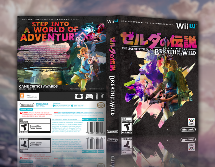
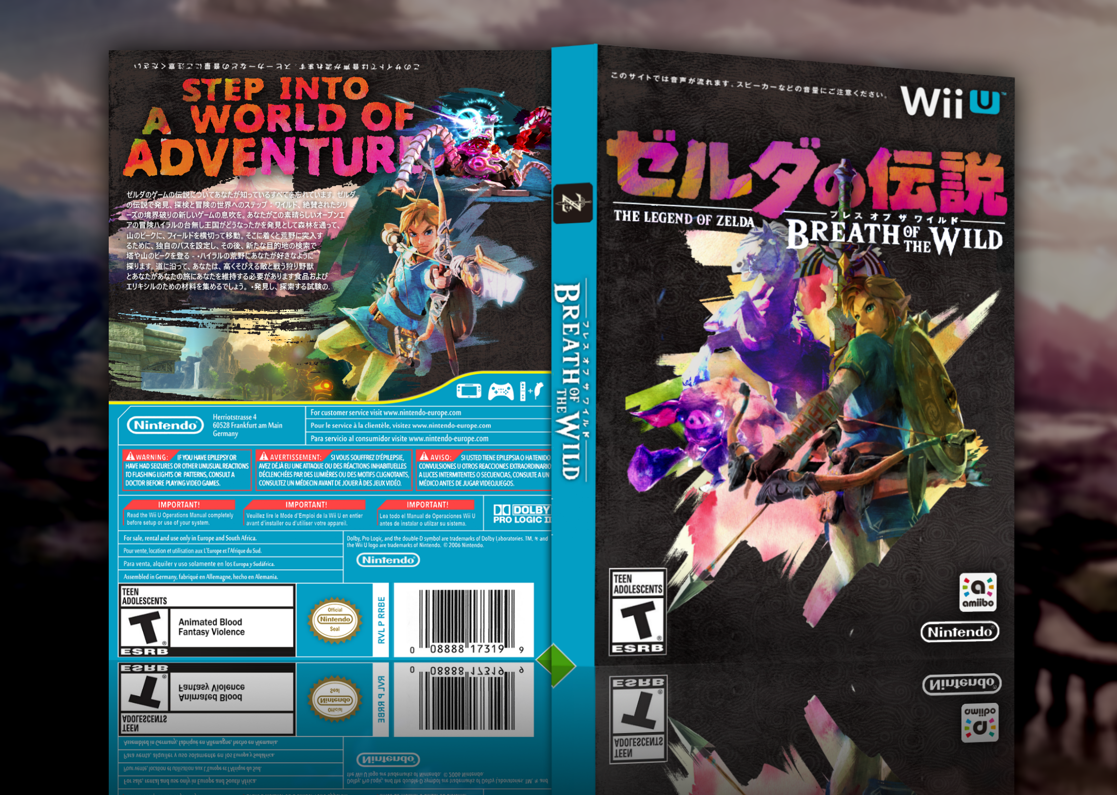
I like front but not fan of Screenshot on back. Good work.
[ Reply ]
presentation could be better but this is some dope shit
[ Reply ]
i think i like this overall, but i *do* have some issues lmao:
--whatever color adjustments you've used in/around Link's face on the front have made him far too yellow
--the description on the back is a tad hard to read. i'd suggest using either a larger font size or a different, bolder font altogether
--not a huge fan of the overlap of the Guardian art and Link's art, but i don't have any suggestions. i think it mostly bugs me bc the brush strokes are going in totally different directions so there's a disconnect that's made
--this might just be me but it really looks like both the ESRB and the Amiibo icon on the front didn't perspective warp like everything else
--additionally, the full view is overall just a tad blurry, both on my retina display and on my normal density monitor.
BUT, i love the use of bold color, I love how you've incorporated the japanese logo design throughout the entire box, and I like your choice of font for the "step into a world of adventure" header. overall it's still v solid !! +fav
[ Reply ]
You can't just put Japanese logos and text on a US box and expect it to work.
[ Reply ]
This crossed my mind too, there's a weird mix from both regions.
[ Reply ]
it wouldn't ever happen in an official box but like, from a design standpoint it's totally fine tbh ??
[ Reply ]
well, visual design standpoint. there's an argument to be made for it not working from an information design perspective
[ Reply ]
I kinda pictured it as a special edition or something. The logo's too good not to use lol.
[ Reply ]
did you make that logo!? I LOVE this!
[ Reply ]
The logo itself is the official Japanese one, but I did all the coloring and rendering myself.
[ Reply ]
How did I miss that?
[ Reply ]
BEAUTYFUL! Ear me, I am creating a pc version of the cover, where did you get the background of the front face? (I will not post my version here)
[ Reply ]
Don't need it anymore, result looks good.
[ Reply ]
I made a PC version of the cover by replacing the wiiu icon with a pc one and replaced the wiiu gamepad, pro controller, nunchuck and wiiremote with keyboard and gamepad icons on the back. If you wanna see it and maybe help me, reply my comment
[ Reply ]
Oh hey sorry I just saw this comment. I’ll go back in to my desktop and see if I have the original file saved anywhere.
[ Reply ]
Can you make a flat version of it? 3D one it difficult to use in my program
[ Reply ]