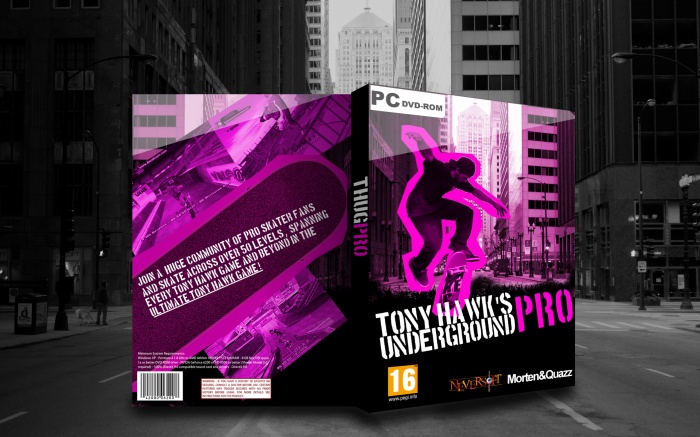
If I'm honest, I think it could be better. The idea for the front is good, although I find that the purple outline could use some texturing, and I think that the guy should be bigger to make it take more space, because it looks a bit empty on the right at the moment.
As for the back, I believe that the text needs to be tilted in the same way the skate is tilted, or viceversa, it looks somewhat odd, at the moment. To be honest, I don't think it has a good structure on the whole at the moment, maybe adding some other summary text and have a tagline that goes on the skate?
As it stands, it's not bad, but I feel like it could be better, in my opinion. Sorry if I seemed a bit too nitpicky on this.
Front feels to similar in design to UG 1 & 2, and the back has a pretty unappealing design, it's too purple; the text doesn't look good and the screenshot placement also looks bad.
 Tony Hawk's Underground Pro Box Cover Comments
If I'm honest, I think it could be better. The idea for the front is good, although I find that the purple outline could use some texturing, and I think that the guy should be bigger to make it take more space, because it looks a bit empty on the right at the moment.
As for the back, I believe that the text needs to be tilted in the same way the skate is tilted, or viceversa, it looks somewhat odd, at the moment. To be honest, I don't think it has a good structure on the whole at the moment, maybe adding some other summary text and have a tagline that goes on the skate?
As it stands, it's not bad, but I feel like it could be better, in my opinion. Sorry if I seemed a bit too nitpicky on this.
[ Reply ]
Little bit simple, but you show good potential in your work, keep it up. I agree with the above.
[ Reply ]
I like it, quite a punky design well done. I feel the back is a bit empty, maybe adding a tagline, bold and purple at the top would help.
[ Reply ]
Front feels to similar in design to UG 1 & 2, and the back has a pretty unappealing design, it's too purple; the text doesn't look good and the screenshot placement also looks bad.
[ Reply ]