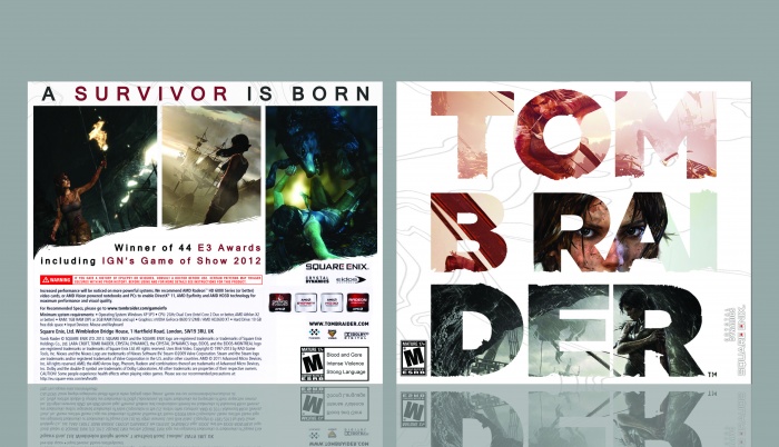
Not a fan of the front's organisation, as Vince said, it looks like Tom B Rai Der.
The back is good, but it is very similar to the official cover. Try to be more original.
I love this dude. Really like the creativity of the typography on the front and the back is clean and fitting. Awesome job! I would just recommend trimming the gap between the 'B' and the 'RAI'. Other than that, its damn good.
In all honestly, it's not a bad idea, but it would look better if it wasn't cut up like that. Stack the words, and have the entire word in one line. It'll look way better.
I will say this looks good for a first cover, and welcome to the site.
I like the simple organized back, not a fan of the front though (the idea is fine, but the spacing of the letters are off and the color tone doesn't really match the back)
 Tomb Raider Box Cover Comments
nice for the first cover
[ Reply ]
Looks a bit odd having the logo split up on different lines. Looks like it says Tom Bra Der
[ Reply ]
Not a fan of the front's organisation, as Vince said, it looks like Tom B Rai Der.
The back is good, but it is very similar to the official cover. Try to be more original.
[ Reply ]
I love this dude. Really like the creativity of the typography on the front and the back is clean and fitting. Awesome job! I would just recommend trimming the gap between the 'B' and the 'RAI'. Other than that, its damn good.
[ Reply ]
my favorite game: "Tom B Rai Der".
In all honestly, it's not a bad idea, but it would look better if it wasn't cut up like that. Stack the words, and have the entire word in one line. It'll look way better.
I will say this looks good for a first cover, and welcome to the site.
[ Reply ]
I like the simple organized back, not a fan of the front though (the idea is fine, but the spacing of the letters are off and the color tone doesn't really match the back)
[ Reply ]
i think not bad
[ Reply ]