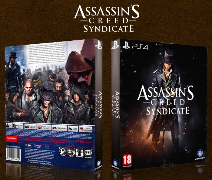
This is pretty good actually. I really like the front.That worn out, grungy texture really works well, I would have liked to have seen more of it on the back. The spine is fine as far as intentions, but is a little sloppy on the execution. I think the Playstation logo at the top is too big, and too close to the edges, and the same applies to the ACS logo. One way you could fix that is by taking the word "Syndicate" and moving it over to the right hand side of "Assassin's Creed". That way the text is longer rather than tall and bulky.
The back has potential, and could be great with some more work. It doesn't really link up with the front, in that its really bright and the font is dark. So i kinda feels disconnected as a piece. I think that the blue template would work much nicer if black. I like your idea of creating a mashup of the screenshots, but its just lacking the final finesse to work. The lighting on the screenshots is different so they don't merge, and Jacob is essentially clipping through that girl on the left. They text on the top is also really close to the edge, similar to the spine, so maybe that something you could work on in the future. Ultimately its a pretty good stab, and some good ideas, but I think you can do better =)
Only thoughts I have on this is the back is pretty lazy. The front however is how I design mine, very simple. I like that. The logo however in my opinion should be moved down to the guys knees. And also I just saw this, but you have the same character on the back as you do on the front. Try just one and put some screenshots on the back.
 Assassin's Creed Syndicate Box Cover Comments
This is pretty good actually. I really like the front.That worn out, grungy texture really works well, I would have liked to have seen more of it on the back. The spine is fine as far as intentions, but is a little sloppy on the execution. I think the Playstation logo at the top is too big, and too close to the edges, and the same applies to the ACS logo. One way you could fix that is by taking the word "Syndicate" and moving it over to the right hand side of "Assassin's Creed". That way the text is longer rather than tall and bulky.
The back has potential, and could be great with some more work. It doesn't really link up with the front, in that its really bright and the font is dark. So i kinda feels disconnected as a piece. I think that the blue template would work much nicer if black. I like your idea of creating a mashup of the screenshots, but its just lacking the final finesse to work. The lighting on the screenshots is different so they don't merge, and Jacob is essentially clipping through that girl on the left. They text on the top is also really close to the edge, similar to the spine, so maybe that something you could work on in the future. Ultimately its a pretty good stab, and some good ideas, but I think you can do better =)
[ Reply ]
^^ Agree with Mat. You are getting better however!
[ Reply ]
Thank's for the feedback
[ Reply ]
Very Nice :-$
[ Reply ]
Thank you
[ Reply ]
Very Special And Exclusive. Keep This Style On Your Boxes
[ Reply ]
OK Thank You
[ Reply ]
Only thoughts I have on this is the back is pretty lazy. The front however is how I design mine, very simple. I like that. The logo however in my opinion should be moved down to the guys knees. And also I just saw this, but you have the same character on the back as you do on the front. Try just one and put some screenshots on the back.
[ Reply ]