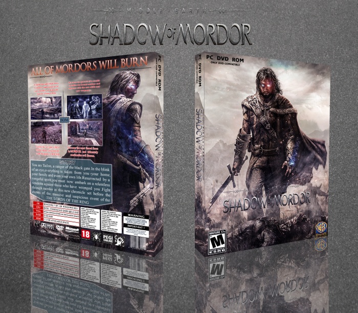
I think the colour scheme quite suits the game however the design itself could do with improving. Never stretch logos, renders, pictures or anything you use in a design. Else it will look odd.
The back I feel doesnt have a very nice structure. The story box seems overly big with too big text. I feel you could have made the screenshots and story box go the whole width of the back and had Talion at the top with a heading, would have made the design nicer.
Finally, viewing in full size this looks quite low res. Try finding higher res pictures to use or maybe try working with higher dpi settings
 Middle-earth: Shadow of Mordor Box Cover Comments
Superb
[ Reply ]
thanks
[ Reply ]
good...but back cover hard work my freind
[ Reply ]
ok
[ Reply ]
Wow
[ Reply ]
thanks
[ Reply ]
nice work
[ Reply ]
shukriyaa
[ Reply ]
Very Nice ;)
[ Reply ]
thanks
[ Reply ]
Very Nice
[ Reply ]
thanks
[ Reply ]
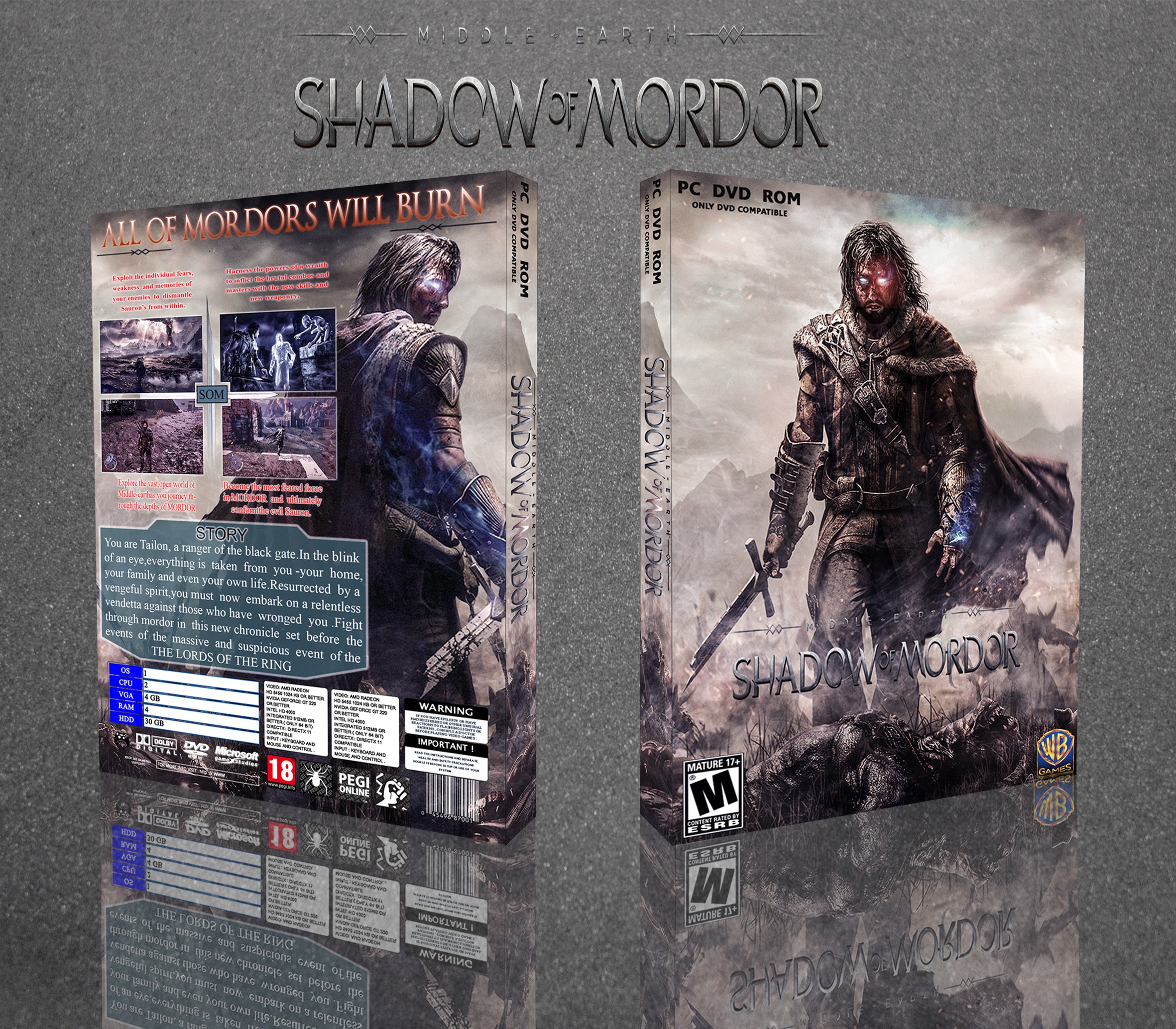
I think the colour scheme quite suits the game however the design itself could do with improving. Never stretch logos, renders, pictures or anything you use in a design. Else it will look odd.
The back I feel doesnt have a very nice structure. The story box seems overly big with too big text. I feel you could have made the screenshots and story box go the whole width of the back and had Talion at the top with a heading, would have made the design nicer.
Finally, viewing in full size this looks quite low res. Try finding higher res pictures to use or maybe try working with higher dpi settings
[ Reply ]
thanks i learn from you..
[ Reply ]