![]() »
»
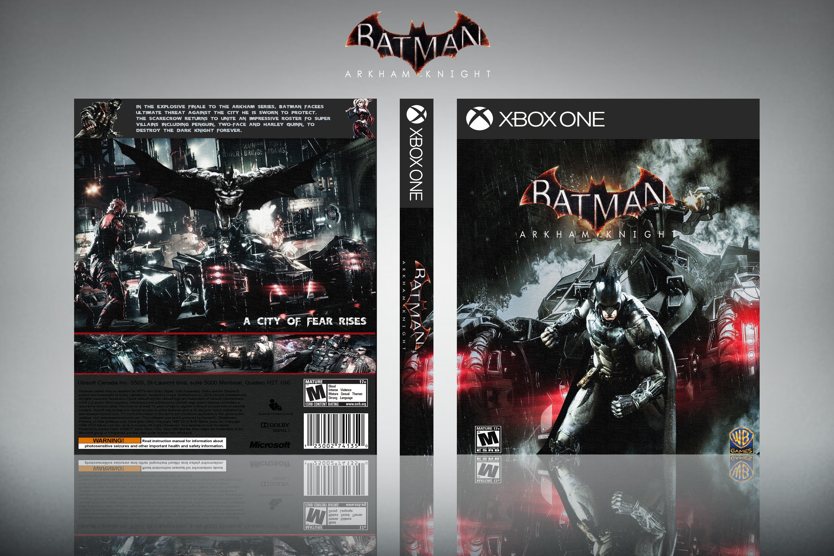
[ Box updated on March 31st, 2016 ] [ original ]
 Batman Arkham Knight Box Cover Comments
Comment on edward91's Batman Arkham Knight Box Art / Cover.
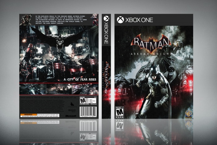
This is pretty decent. The logos on the front cover are too close to the edge and the back has text that is quite hard to read. Also on the back, I think Scarecrow and Harley renders are quite pointless in that bar.
I would like to quite see you do more work on the back next time. As all your cases have a very similar back. With the bar at the top with text in, main image below and then screenshots below that.
[ Reply ]
Thanks
[ Reply ]
Looks nice. This would look A LOT better with some updates. First off get rid of that filter you have on the box. You don't really see it anyways until you full-screen it. For the front, Batman and the logo don't look aligned. Move the logo to the right a smidge. As for the back, try getting rid of the top bar and move your renders down. Try moving that image up and maybe add an inner glow to it to soften the edges. That should make some space for your renders so you don't have to eliminate them completely. Btw this is the most detailed feedback I've given someone. Your Welcome. lol
[ Reply ]
you're*
[ Reply ]
the pro has spoken ;)
[ Reply ]
@Vince_1990 Did you see that too? lol no one am i PROFESSIONAL! stamp "NOOB" on my forehead if you must.
[ Reply ]
@AnaRchyxV2x hahaha AnoobRchyxV2x
[ Reply ]
Ok
[ Reply ]
Cool
[ Reply ]
Thanks
[ Reply ]
nice
[ Reply ]
thanks
[ Reply ]
nice dude
[ Reply ]
thanks
[ Reply ]