To be honest, Im not really a fan. Front and Back you are using pictures logos or renders that have been stretched. The 18 logo is too close to the edge on the front. And the main text is too close to the edge on the back and doesnt look like its presented in a nice way. The same goes for the tag line and main big screenshot. The fonts on the back dont fit Dragon Age either. I would chage them too.
YOU MUST TRY HARDER MY FRIEND. GET HELP FROM OTHER DESIGNERS SUCH AS "IMANPRO- AJAY OR ME" AND IMPROVE YOUR SKILLS. YOU SHOULD DO THIS. IT'S ALL UP TO YOU.FINISH THIS WORK STRONGLY
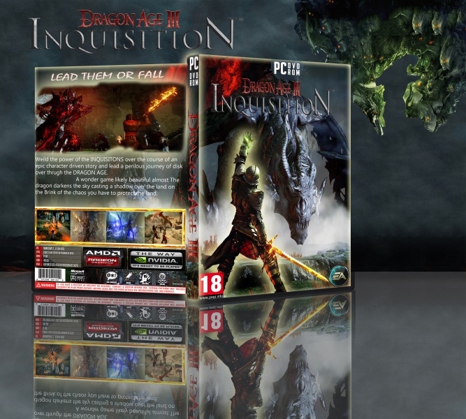
 Dragon Age: Inquisition Box Cover Comments
To be honest, Im not really a fan. Front and Back you are using pictures logos or renders that have been stretched. The 18 logo is too close to the edge on the front. And the main text is too close to the edge on the back and doesnt look like its presented in a nice way. The same goes for the tag line and main big screenshot. The fonts on the back dont fit Dragon Age either. I would chage them too.
[ Reply ]
thanks i will try better nxt time vince
[ Reply ]
YOU MUST TRY HARDER MY FRIEND. GET HELP FROM OTHER DESIGNERS SUCH AS "IMANPRO- AJAY OR ME" AND IMPROVE YOUR SKILLS. YOU SHOULD DO THIS. IT'S ALL UP TO YOU.FINISH THIS WORK STRONGLY
[ Reply ]
Hard work but nice
[ Reply ]
very nice
[ Reply ]