Yes, if the box art looks similar to something, I took "inspiration" from this. link
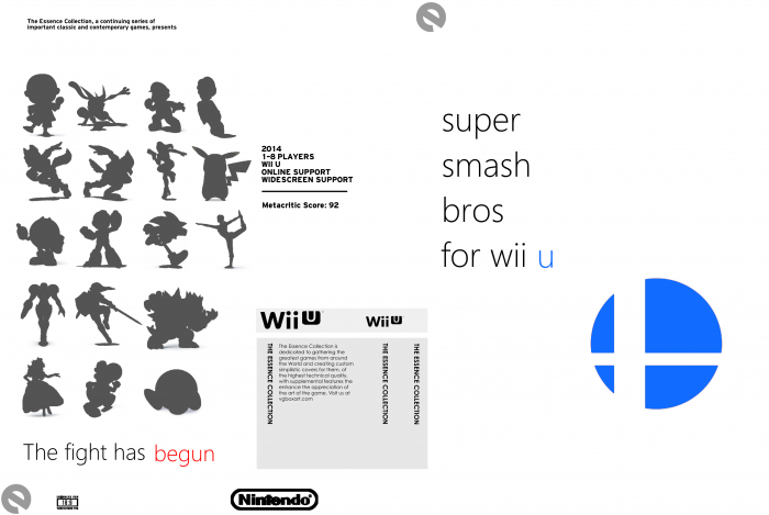
A simplistic cover for Super Smash Bros. that is using the Essence Collection template.
 Super Smash Bros. for Wii U Box Cover Comments
Comment on DarknessDudeTOB's Super Smash Bros. for Wii U Box Art / Cover.
I think the front's a little TOO simplistic for me (and in fact, I can see the original logo behind it. Probably should have deleted that to make it look sharper). I get the idea behind it, but I wonder if a faded silhouette would make for a better look on the front (say, Master Hand or something).
Minimalism isn't just putting a logo and title on a template and calling it a day, it's about subtlety and understanding of the subject's mechanics/story/aesthetics. Just experiment a little and come up with an idea that both suits the game, and looks good. Keep trying.
[ Reply ]
Gotta love minimalism for the sake of minimalism.
This looks really uninspired TBH.
[ Reply ]