I made another music box for some reason; next one is gonna be a game, I swear!
Truth be told I'm actually really proud of this one, turned out way better than my original concept for it.
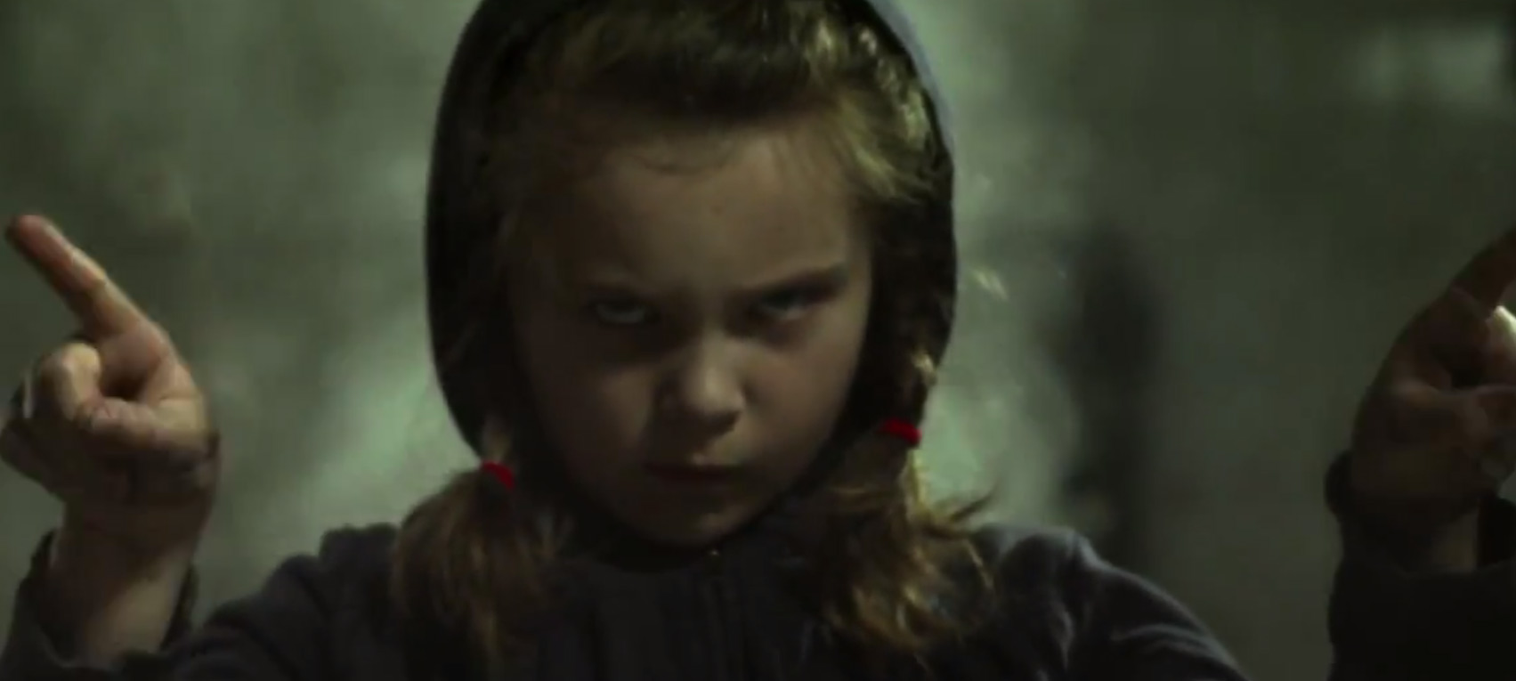
Just so you guys can tell that there was a bit of effort put in the back; here's the original image of the girl I worked with link
 Skrillex: More Monsters And Sprites Cover Comments
Comment on spypilot's Skrillex: More Monsters And Sprites Cover.
With the help of VGBOXART'S STATE OF THE ART FOLLOWING SYSTEM, I was able to see this design!
Looks good, dude. I know very little about Skrillex's work other than the genre, so whether or not it's fitting of the album I couldn't tell you. It looks nice though, so that's all that matters.
[ Reply ]
Imagine loud robot screams. That's Skrillex's music.
The box is based off of the Equinox music video.
[ Reply ]
I'll have to give it a watch.
[ Reply ]
I do not like and I'll tell you why.
The barcode is misplaced in the top right part of the back, is horrible. The font is way too simple, and for example, the image that you used on the back cover (face girl) has poor quality compared to the front cover, ie, looks very blurry. The only thing I like is the front cover. The presentation is somewhat rare. honestly else is boring
[ Reply ]
I don't see what's wrong with the bar code?
The front achieved what I wanted it to though, a long and empty corridor with the monster from the music video standing in the middle off it off in the distance. Simple? Maybe; Effective? I'd say.
I can't do much about the girl on the back, i never blew up the image (in fact i shrunk it) that's just the quality of the photo, hate skrillex's cameraman for that one. Still, I don't really think the image quality on it is THAT bad either.
[ Reply ]
Thanks for your critique though I appreciate this kinda stuff.
[ Reply ]
Not bad.
I like the front, I don't like the back. I generally agree with Warsony.
But nonetheless, there are certain elements I do like.
[ Reply ]
What's wrong with the back lol
Thanks for the fave tho.
[ Reply ]
Hey, not bad at all.
As for the barcode subject that was mentioned before, I think it would be better if there was some breathing space between the edges of the box and the barcode itself.
Also, I feel the tracklist should be a bit separated from the legal text.
Still, not bad at all. :D
And also, Scary Monsters (Noisia Remix) > Scary Monsters (Original).
[ Reply ]
The Zedd remix is the best version of the song IMO, it has an amazing buildup to the drop that doesn't really happen lol.
Also, about the legal text thing, i thought the gold social network info was enough to do it, personally.
[ Reply ]
Im not a fan. You can barely see anything on the box, so it just looks like wallpaper. Barcodes not a problem but i just feel as if its hard to see and apprediate all the work that was done.
[ Reply ]
Appreciate*
[ Reply ]
??
The whole cover is cast in shadow, that's part of the design.
Truth be told there isn't much complexity to be had, its a man in a tunnel and an angry girl on the back. What I tried to do was make it dark and creepy.
Thanks for the comment though I do appreciate other's thoughts and opinions.
[ Reply ]
How did you make the box?
[ Reply ]
Carefully
[ Reply ]
@spypilot Did you make it on PhotoShop?
[ Reply ]
@Jakis yeah, elements 11.
[ Reply ]