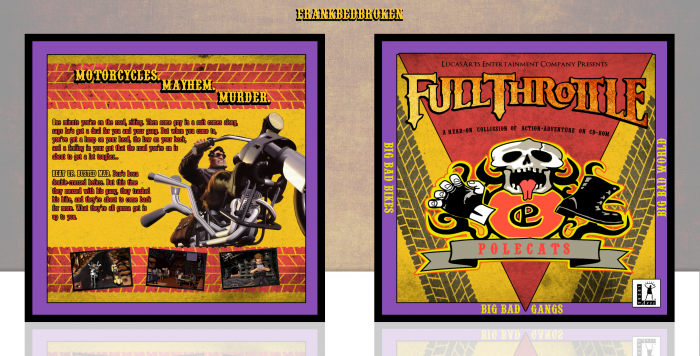
In my opinion, Full Throttle is one of the best adventure games ever, only topped by Grim Fandango, Monkey Island 3 and Broken Sword, and I felt like making another box for an adventure game, so, why not, right?
I got inspired (as in blatantly copying the concept) on the design for this bandana that was merchandise for the game.
link
Which meant, you guessed it, custom art! Yaaaaaaaay, this is going to suck. Oh, and merry christmas or something.
As always, constructive criticism is welcome, and huge thanks to Carlj1497 for the help and feedback in the forums, it's greatly appreciated.
Hope you like it! :D
 Full Throttle Box Cover Comments
Comment on FrankBedbroken's Full Throttle Box Art / Cover.
Great work Frank, it might look better with a different colour border
instead of the blue
[ Reply ]
Thanks, Vince. It's actually purple, but, I don't know, I think it looks fine as it is. If many people think that I should change the border, I'll update it. :D
[ Reply ]
@FraFrankBedbrok i will trust you with colours. I'm colourblind so it probably just looks strange to me
[ Reply ]
Great job! I like the purple, it seems to go well with the red and yellow.
[ Reply ]
Thanks, Carl! Yeah, I thought it was fitting as well. :D
[ Reply ]
This looks great!
I saw a quick glimpse of it in the WIP but not much due to Christmas and stuff. It came out really nice.
I like the purple border, in my opinion, it makes the centre design stand out more.
[ Reply ]
Thanks, Nathan! Yeah, I kinda took the wrong choice to post this around Christmas time, but I needed to sketch out the idea quickly. :D
[ Reply ]
@FrankBedbroken
Speaking of being busy, haven't done much on the collab we're doing. I'll carry on as soon as I can now that Christmas is over.
[ Reply ]
@TheTombRaider It's cool, man, we can take all the time we want to make sure it comes out really good. ;)
[ Reply ]
Agree With Vince For Colour border , But This Look Really Great Job & Nice Colored . . .
[ Reply ]
Thanks, Matin! :D
[ Reply ]
Nice mate
[ Reply ]
thanks dude
[ Reply ]
I actually like the purple, but do feel like it's a shade of purple that favors a red tone more than a blue one. Maybe an indigo would have been better?
Also, not sure about the one letter being yellow in the summary. I would just stick to the "O" being red or give the first sentence in the first paragraph a similiar treatment as the first sentence in the second paragraph.
Overall though, I think this is a really nice box. Definitely has a fitting theme and color scheme to the game itself. Great job.
[ Reply ]
Thanks, Lucid! I tried to mimick the official back's text composition (with the O being a different color to the rest of the text), but it apparently didn't work out. I'm gonna leave an indigo border version over here, to see if it looks better. :D
[ Reply ]
@FrankBedbroken Does it look better like this? link
[ Reply ]
@FrankBedbroken Hmm, better. I think the shade is not quite right yet. Maybe lighter?
[ Reply ]
Very Nice Frank , I love cover ;)
[ Reply ]
Thanks, Amin! :D
[ Reply ]