![]() »
»
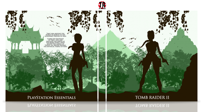
This is a simple box art for Tomb Raider II
Thanks to FrankBedbroken for the help in the WIPs, and Carlj1497 & Spypilot for the early guidance.
Constructive Criticism is appreciated ^.^
 Tomb Raider II Box Cover Comments
Comment on TheTombRaider's Tomb Raider II Box Art / Cover.
When I mentioned text, I was thinking of a black box next to Lara, similar to what you did on Tomb Raider: Uncharted. But this looks better, in my opinion.
As I said, I really like it. Nice job, Nathan! :)
[ Reply ]
I actually did that at first, but it looked like Lara was getting smacked by a big black block... so I changed it haha
Thanks Frank, and thanks for your help in the WIPs ^.^
[ Reply ]
If your name is Nathan, how do you possibly think Uncharted is worse than Tomb Raider?
[ Reply ]
How can you possibly think my name can influence how much I like a game?
[ Reply ]
@TheTombRaider idk, if there was a dude in a game named spypilot it would be my favorite game.
[ Reply ]
Well my favourite franchises are Tomb Raider, Zelda and Mario, there's no one called Nathan in any of them.
[ Reply ]
@TheTombRaider If you really wanted it to be, the name of Link could be Nathan.
[ Reply ]
@spypilot I'll pass
[ Reply ]
Heh, nice ;) it's similar to my Assassin's Creed collection :)
[ Reply ]
Thanks man!
It isn't really similar, it's just that we both used silhouettes.
[ Reply ]
@TheTombRaider yeah, yeah, you're right ;) but it remembers me about my collection, that I think ;) again, good job ;)
[ Reply ]
I can definitely see what you mean, again, thanks :)
[ Reply ]
Honestly, I really don't like it.
The whole box seems to be lazy all the way through. Silhouettes make it boring, text feels plastered on, and the re-used renders don't exactly help.
Sorry, not a fan.
[ Reply ]
I can understand what you mean.
But that's just the art style I went for, and I can respect you don't like the style.
[ Reply ]
Nice man, I really like this one. Maybe flip and play with some of the tree renders so they look a bit different. But overall good work Nathan!
[ Reply ]
Yeah I kinda agree with you there, I should've done that.
Thanks for the compliments, Vince! ^.^
[ Reply ]
Gonna kinda contradict another commenter here and say I actually really dig the silhouettes, and the cool layered jungle thing you've got going on there. One thing I'd say is the game's name on the spine would be nice :)
[ Reply ]
I tried having the logo on the spine, but it didn't look right.
Nonetheless, thanks for the kind words, Danny! ^.^
[ Reply ]
@TheTombRaider Ah, that's fair enough then. As a collector it just pains me whenever a spine's like that, but that's largely down to me having the burning desire to display everything perfectly on a shelf xD
[ Reply ]
@danny-21_
I'm also a collector, I know what you mean xD
[ Reply ]
Yes it's a simple box but it looks great.
The only thing I could say is that the spine looks unnecessary, unless you add the title or the playstation logo on it.
But shit, this still great.
[ Reply ]
Thanks man, I really appreciate that! ;)
[ Reply ]
I really like the layering and colors chosen. Very nice. I especially love the splash of black through the vines and foreground.
Echoing other commenters though, this definitely needs a title in the spine otherwise the it's pretty useless because you wouldn't be able to tell what the box is on a shelf.
[ Reply ]
Since so many people have mentioned this, I'll add it in.
Thanks Lucid!! ^.^
[ Reply ]
Nice Job ;)
[ Reply ]
Thanks Amin ;)
[ Reply ]
Actual criticism here; I don't really know how it could be fixed, but the description text kinda ruins the flow you have going on, I still like the box but it would be much nicer if the text blended into the design a little better.
[ Reply ]
That's just it though, I don't know how that can be fixed.
[ Reply ]
@TheTombRaider you try cutting out the tree that covers the majority of the temple on the back, and putting the text there?
[ Reply ]
@spypilot I'll try it
[ Reply ]
nice work
[ Reply ]
Thanks Iman ^.^
[ Reply ]
Nice Job
[ Reply ]
Thank you :)
[ Reply ]
wow, gud
[ Reply ]
Tanks
[ Reply ]
Different Style Of You,Good Job Nathan . . .
[ Reply ]
It is isn't it, thanks Matin :)
[ Reply ]
The only thing I don't like is the font placement. The logo to me doesn't look right down there and I feel should be a little more focused. Maybe if you moved the back Laura render and pushed in more on the side so you could have had the logo behind the mountains? Just an idea or concept that came to my head. Also I agree that the description ruins the flow of the design. Maybe if you had it behind a rock to make it stand out and keep the design's concept. Overall, I love the colors and creativity. Good job man :)
[ Reply ]
Thanks man, I'll see what I can do :)
[ Reply ]
I just love the effect you used is elegant and also the environment is very striking, one of the best games! Very cute my friend :D
[ Reply ]
Thanks Walter, this is one of my favourite games as well! ^.^
[ Reply ]
Wonderful!
[ Reply ]
Thank you!!
[ Reply ]
Congrats Nathan . . .
[ Reply ]
Thanks Matin!
[ Reply ]
Two HOF in two days O_o
Congrats, you deserve it!
[ Reply ]
I know I was shocked to see this, thanks a lot man! :)
[ Reply ]
Congratulations Nathan. I love this case
[ Reply ]
Thanks for the kind words Vince! :)
[ Reply ]
Congrats Nathan ;)
[ Reply ]
Thank you Amin ^.^
[ Reply ]
Wow, two Hall of Fames in two days, thank you everyone! ^.^
[ Reply ]
I like it. Nice and clean.
[ Reply ]
Thanks :)
[ Reply ]