![]() »
»
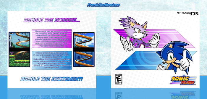
New box!
In one moment I had to make a Sonic box, given the huge amount of resources that are around, and since I kinda liked Sonic Rush, I decided to go with that. Also, I'm starting to notice a bit of a pattern with my boxes recently, I put up a box with a warm color scheme, then one with a cold color scheme, and so on, and so forth.
Anyways, as always, constructive criticism is welcome, and huge thanks to TheTombRaider, lucidhalos and GameRoomProductions for the help and feedback, it's really appreciated.
Hope you like it! :)
 Sonic Rush Box Cover Comments
Comment on FrankBedbroken's Sonic Rush Box Art / Cover.
Simple but efficient
[ Reply ]
Thanks, Alex! :D Yeah, I do tend to go simplistic in most of my designs, but I don't know, I just feel better doing simple designs that hopefully looks better in the end.
[ Reply ]
I like it, great work :)
[ Reply ]
Thanks, Nathan! :D
[ Reply ]
The front looks good, but something about the back is really throwing me off.
wish I could tell you what it was but I really dont know what it is.
[ Reply ]
Thanks, spypilot! Yeah, I did felt sort of uncomfortable with the back but I didn't know why, so I just left it as is.
[ Reply ]
This is Perfect ! :)
[ Reply ]
Thanks, Warsony! :)
[ Reply ]
This turned out really nice.
[ Reply ]
Thanks for the feedback, lucid! :D
[ Reply ]
Nice and simple, that front is perfect.
[ Reply ]
Thanks, GRP! Also, thanks for the feedback on the forums! :D
[ Reply ]
Simple and Nice :)
[ Reply ]
Thanks, JR! :)
[ Reply ]
Clean & Nice ;)
[ Reply ]
Thanks, Amin! :D
[ Reply ]
I don't like sonic's overlapping back spike - looks odd, the rest is clean and good
[ Reply ]
Yeah, don't know why I left that, I'll fix it. Thanks, Jakob! :D
[ Reply ]
Hmmm, I love the front, but the back, well...
I don't think they work well together, because the front feels like it's in motion, which is great for a sonic game. The back just feels too still. I know the tagline(s) have that movement feel but the rest doesn't. It would be fine, but paired with the speedy-feeling front, the back just feels like an abrupt stop. It's a great box, don't get me wrong, nice and clean, but, you know.
[ Reply ]
Thanks, Carl! As I mentioned before I did felt a bit uncomfortable with the back, and now I know why. Don't know how to fix it, though, any suggestions you have? :D
[ Reply ]
@FrankBedbroken Okay believe me, I'm not trying to promote my own work, but I can't really find another example. I just thought that maybe this could give you an idea about making a back that seemed to have movement: link
[ Reply ]
Really good...I love the front especially! Great design and color scheme
[ Reply ]
Thanks, UV! :D
[ Reply ]
Like the 'duality' of the design, very good job.
[ Reply ]
Thanks, Moebius! :D
[ Reply ]
Congrats Frank, love this one
[ Reply ]
Thanks, Vince! :D
[ Reply ]