![]() »
»
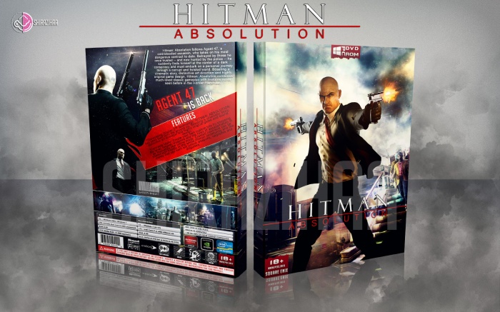
Image : link - link
Logo : link
Render : link - link - link
20/11/14 - Updated Box
After : link
Before : link
[ Box updated on November 20th, 2014 ] [ original ]
 Hitman Absolution Box Cover Comments
Comment on shirazihaa's Hitman Absolution Box Art / Cover.
I like the front a lot. The whole colors of it are cool.
Not so fond of the back, though. I'm not a fan of how "is back" is slanted. And I find that the Features box looks a bit disconnected from the whole thing you're trying to go with, and it feels awkward.
Overall, not bad. It's not your best, but it's not bad at all.
[ Reply ]
very very nice my bro
[ Reply ]
Beautiful as always.
[ Reply ]
I agree with Frank... I think the back might have looked better if the big render of agent 47 was looking forward, there is just too much black on the back. I don't really like the way there is a smaller render on top of the big render too. Feels unessasary...
Front cover is beautiful. 8 out of 10
[ Reply ]
Yeah, cool :D
[ Reply ]
The front is great, I agree with Frank and Vince about the back
[ Reply ]
Really Nice Job . . .
[ Reply ]
This feels shockingly empty, and the red part on the back looks weird. Not as good as your usual work, sorry!
[ Reply ]
I'm sorry 2...
[ Reply ]
I don't like the black stroke on the 'Hitman' logo. Other than that, the front is gorgeous!
[ Reply ]
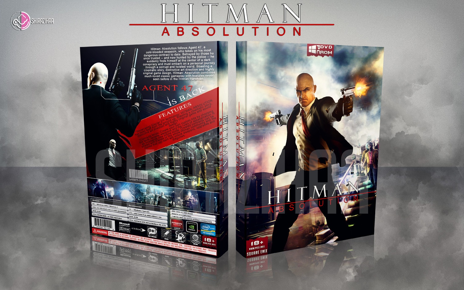
20/11/14 - Updated Box
After : link
Before : link
[ Reply ]
Thanks All Guys ;)
[ Reply ]
Looks Really Much Better . . .
[ Reply ]
@matingsm Thanks Matin ;)
[ Reply ]
Looks better, great work :)
[ Reply ]
Thanks Nathan ;)
[ Reply ]
Better, nice work.
[ Reply ]
Thanks Vincent ;)
[ Reply ]
amazing
[ Reply ]
printable : link
[ Reply ]
Yeah, I like It! :D
[ Reply ]
Thanks ;)
[ Reply ]
Congrats Bus,Well Deserved . . .
[ Reply ]
Thanks Taxi ;)
[ Reply ]
congrats man, well deserved. good luck dealing with crazy;)
[ Reply ]
Thanks Brother ;)
[ Reply ]
Congrats man! ;)
[ Reply ]
Thanks Jakob ;)
[ Reply ]
nice work
[ Reply ]
nice work.
[ Reply ]