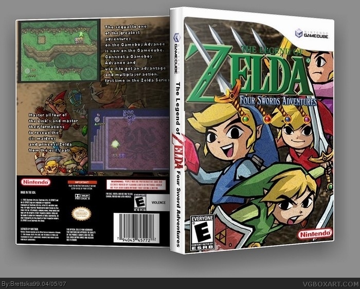
yes i know what i said about zelda boxes but i just couldn't resist, i made the template but credit to Kracker624 for the idea of it and cmt for the 3D, enjoy (and yes i know the spine sucks)
didn't you say you were going to stop these zelda boxes? i know i've done a ton of sonic boxes, but i'm stopping those for a while. i occasionally have a very strong urge to make a new one, but i have to resist. this is not that good anyway.
#2, yea people don't like my backs, its because of the whole text thing isn't it, i tried something different, i typed it all out in white, then i typed it out again in black outline, i took forever to get the 2 alligned
Two little things I noticed...the title on the spine should be centered a little more. Right now it's too much to the right. And the "Violence" in your ESRB logo on the back should probably be chanced to "Fantasy Violence" and it should not be centered, but moved to the upper left corner of the white area.
Red looks like a...GIRL!
but yeah, nice box, i'd give it an 8/10, but yeah i reccomend not doing backs. personally, i suck at backs...and fronts...and spines...
 The Legend of Zelda: Four Sword Adventures Box Cover Comments
yes i know what i said about zelda boxes but i just couldn't resist, i made the template but credit to Kracker624 for the idea of it and cmt for the 3D, enjoy (and yes i know the spine sucks)
[ Reply ]
Front looks pretty good back doesn't I recommend switching to only front boxes
[ Reply ]
didn't you say you were going to stop these zelda boxes? i know i've done a ton of sonic boxes, but i'm stopping those for a while. i occasionally have a very strong urge to make a new one, but i have to resist. this is not that good anyway.
[ Reply ]
#2, yea people don't like my backs, its because of the whole text thing isn't it, i tried something different, i typed it all out in white, then i typed it out again in black outline, i took forever to get the 2 alligned
[ Reply ]
#$, WHy not do a stroke?
[ Reply ]
#3, i know i know its just that im in Zelda phase, and i don't think i can make any more zelda boxes, not enough material
[ Reply ]
#5, how do i get a stroke?
[ Reply ]
I think the back looks good. If the font was readable and a bit bigger, it would look great.
[ Reply ]
#7, you already have a stroke (the black outline) but I recommend a drop shadow
[ Reply ]
#9, the black outline is the text but in outline form, i don't know what a stroke is and thanks koopa
[ Reply ]
Two little things I noticed...the title on the spine should be centered a little more. Right now it's too much to the right. And the "Violence" in your ESRB logo on the back should probably be chanced to "Fantasy Violence" and it should not be centered, but moved to the upper left corner of the white area.
[ Reply ]
Red looks like a...GIRL!
but yeah, nice box, i'd give it an 8/10, but yeah i reccomend not doing backs. personally, i suck at backs...and fronts...and spines...
[ Reply ]