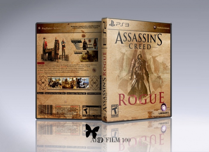
I like this, but there are some things that I dislike as well. The whole project is very small and the back text is illegible. And speaking of text, it looks like some legal text is missing. The back as a whole seems maybe a little empty behind the characters. Perhaps fading something in the background, like on the front, would help.
On the front, I would bring everything down a little bit so as to bring the logo away from the template a little.
As noted already, the spine logo is upside down as well.
I would love to see this improved!
 Assassin's Creed rogue Box Cover Comments
Great work brother...
[ Reply ]
thanks brother
[ Reply ]
Nice one, though I think a 2D presentation would have looked a lot better. That shadow on the back just takes away something from the box.
[ Reply ]
Great
[ Reply ]
Very cool, great job
[ Reply ]
Just noticed that the logo on the spine is upside down
[ Reply ]
I like this, but there are some things that I dislike as well. The whole project is very small and the back text is illegible. And speaking of text, it looks like some legal text is missing. The back as a whole seems maybe a little empty behind the characters. Perhaps fading something in the background, like on the front, would help.
On the front, I would bring everything down a little bit so as to bring the logo away from the template a little.
As noted already, the spine logo is upside down as well.
I would love to see this improved!
[ Reply ]
Good design man :)
[ Reply ]
thanks man
[ Reply ]
Good Work
[ Reply ]
thanks man
[ Reply ]
Very Pretty.
[ Reply ]
thanks man
[ Reply ]
Exelent Work bro,
[ Reply ]
thanks man
[ Reply ]
great job.
[ Reply ]
thanks my friend
[ Reply ]
amazing
[ Reply ]