Thanks for Carlj1497 for the inspiration. Credit to Sens/deiviuxs for the template
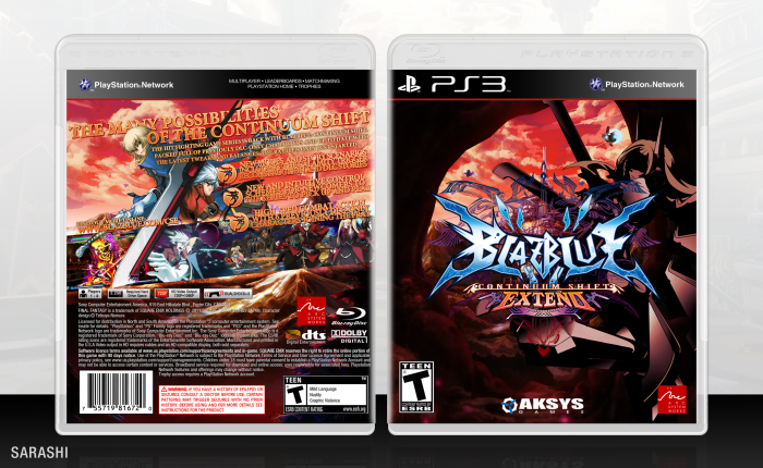
I decided to make another box. Sorry for the bad quality or bad design in advance. Check full view if you want, etc.
 BlazBlue: Continuum Shift Extend Box Cover Comments
Comment on Sarashi's BlazBlue: Continuum Shift Extend Box Art / Cover.
I like the box, although I'm not sure how I inspired you. I'd love to know, though.
[ Reply ]
The back composition of this takes a couple of design cues from your Ultra SFIV box.
[ Reply ]
Nice. Like how dynamic the back is. My only problem with it, is the screencaps. They need some kind of grounding of it's own. Not a fan how it cuts off from the render to the cap. Maybe some kind of subtle glow like the color of the clouds would define it?
[ Reply ]
The back text is a little overbearing. Design is nice.
[ Reply ]
The design is too nice not to favorite, but the text on the back, like mentioned above, can be a bit hard to look at/read.
[ Reply ]
What you did with the front and back covers is very well done, because they 'interact' with each other in a very flowing way, in terms of design. The artworks are in a nice high quality, and I can be wrong but BlazBlue normally don't have good resources to work with.
My only complain is about the text on the back. The arrangement of words are great but you should IMO have used the color blue, in the same way it was used in the 'BlazBlue' logo on some of the text. And a border for the screenshots would have been great.
[ Reply ]
Heh, you haven't seen the abysmal quality of the artwork on the full sized version... What you're seeing is a heavily surface blurred mess.
[ Reply ]
I like the front very much. The back text might be a bit hard to read or make out ( maybe thats just my eyes ). But overall good work on the box.
[ Reply ]