![]() »
»
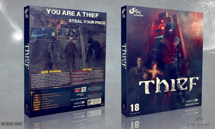
After a Long Time ,It's Finished,I Hope You All Like My New Cover & First Box In 2014 . . .
[ Box updated on July 13th, 2017 ] [ original ]
 Thief Box Cover Comments
Comment on matingsm's Thief Box Art / Cover.
beautiful box . nice matin ;)
[ Reply ]
nice job
[ Reply ]
Great box and have a nice night!
[ Reply ]
This looks phenomenal.
[ Reply ]
Well done ! Nice work man)
[ Reply ]
Good box, but thief is misspelled on the back.
[ Reply ]
Good box, but thief is misspelled on the back.
[ Reply ]
Thanks For Comment,Fix It Back . . .
[ Reply ]
beautiful . thanks matin
[ Reply ]
Good cover especially the back
[ Reply ]
Thanks Man,I'm glad You like it . . .
[ Reply ]
Tanx To All Guys,For Comment & Fav . . .
[ Reply ]
so great. well done
[ Reply ]
Thanks Man . . .
[ Reply ]
amazing
[ Reply ]
He knows.
[ Reply ]
It's not a bad box but it just feels all over the place (mainly on the front side). There's mixed art styles and resolutions on the front and the logo is pretty blurry. The red on the main character is weird (is it supposed to be blood? it kinda just seems like he's glowing or something) and the little burst thing on his hand feels out of place. It all doesn't seem to explain the game too well.
The back is much better. It has a solid layout overall but the main character use is very repetitive, try to avoid using the same person multiple times in main background art, it's un-necessary and confusing most of the time. My last complaint is the header text on the back, it feels a bit too spaced out and you could probably use a better font or maybe dim the white a little so it doesnt stand out so much. Otherwise the back is looking great!
Looking at your other boxes you seem to have a good sense of layouts for the back, you just need to fine tune things and nail down front sides and I think your boxes will improve vastly!
[ Reply ]
First of all,I very thank you for commenting on my box my friend.About blurry front,if you see it in full size it's better and also the printable is really better than this one.that red brush on front is blood sample,and that thing in his hand is a valuble thing like a necklace for example,and about the same characters on back,i wanted to show that the features of a thief i mean his speed and . . .
and most of these problems are about different ways of thinking and tastes.
At the end i have to many thank you for your help i will use them in my future boxes and it's an honor for me to have someone like you near myself.good luck dude . . .
[ Reply ]
@matingsm Sure thing man! I gotcha on the blurryness being just a result of the fitting to the template but the logo still looks like it wasnt great to begin with. I see why you'd wanna use the thief features on the back but it all looks like they're a part of the same scene there and gives it a more co-op game look, maybe if you'd split things up somehow it'd be better.
Yeah though I suppose some of that was matter of opinion but I'm glad you didn't take any of what I said negatively haha. I look forward to seeing more from you and watching you improve dude!
[ Reply ]
@DeathSpawn11 Bro,It Was a Pleasure For Me To know your idea,Thanks i'll use your Guidance in My Future Works,Thanks Dude . . .
[ Reply ]
Nice! As usually ;) And PC version!!! good work, Bro! ;)
[ Reply ]
Really Thanks Bro . . .
[ Reply ]
congrats
[ Reply ]
Thanks carl . . .
[ Reply ]
Congrats Man :-D
[ Reply ]
Thanks Majid,I'm glad You like it Man . . .
[ Reply ]
Congrats Brother ;)
[ Reply ]
Thanks Amin . . .
[ Reply ]
Congrats, That's well deserved :))
[ Reply ]
Thanks Payami :))
[ Reply ]
Way to go! :)
[ Reply ]
Many Thanks Bro . . .
[ Reply ]
Again,Tanx To All Guys For The Hof . . .
[ Reply ]
well done...
[ Reply ]
Thanks Bro . . .
[ Reply ]
Printable Added . . .
[ Reply ]
Congrats Matin...
[ Reply ]
Thanks Dear Fergana . . .
[ Reply ]
great box love it, but there are a few things to improve for example there are a few letters with black in it in the lower right corner of the backside. and there aren't so many features mentioned but for a game that's not even released yet it's absolutely great.
[ Reply ]
Really great design. Room for a couple improvements though. The font on the specs table is kind of strange, I would have re-used one that's already used somewhere else in the design. Also you've got mixed ESRB & PEGI ratings and the logo on the front should be centered I think. And as someone mentioned before, the unnecessary repeating appearances of Garret on the back make it kind of confusing and a little too busy.
[ Reply ]
you are the best
[ Reply ]
Thanks Man . . .
[ Reply ]
#End: Thank you everyone for the comments & Fav & Watching And for the hall of fame . . .
[ Reply ]
Its Bestly
Nomrash 20
[ Reply ]