[ Buy DESTINY at Amazon ] » 2014 Hall of Fame Winner! By shirazihaa 50 on December 27th, 2013 No Printable Available 
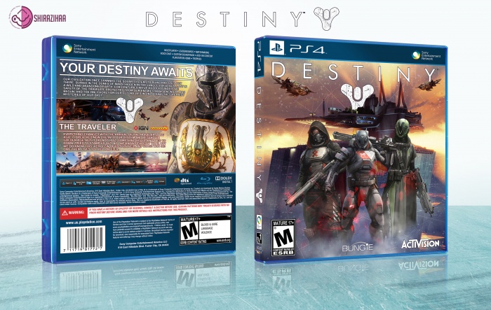
Please See Full Size : 3000*1900 Logo : link - link Template : link - link Image : link DESTINY Box Cover Comments Comment on shirazihaa's DESTINY Box Art / Cover. Cancel Reply Oddmania 40 [ 1 decade ago ] Excellent, it looks very professional. May I suggest you soften the edge of the spine? It looks pretty sharp. [ Reply ] shirazihaa 50 [ 1 decade ago ] ok ;) Thanks For Comment [ Reply ] EdwardPines 43 [ 1 decade ago ] nice work dude [ Reply ] shirazihaa 50 [ 1 decade ago ] Thanks ;) [ Reply ] iCANDY 14 [ 1 decade ago ] Really nice one but as oddmania said edge looks sharp [ Reply ] shirazihaa 50 [ 1 decade ago ] ok. Thanks [ Reply ] matingsm 50 [ 1 decade ago ] Looks Great . . . [ Reply ] shirazihaa 50 [ 1 decade ago ] Thanks Matin [ Reply ] WiECZUR9611 42 [ 1 decade ago ] Nice work Bro :) [ Reply ] shirazihaa 50 [ 1 decade ago ] Thanks [ Reply ] XBU Philippe 36 [ 1 decade ago ] Renders on front seem a bit pasted. Not really a fan of the ship in front of the logo On the back there is too much text and the font is too small imo. Don't like that every text and the logo has an outline. :-/ [ Reply ] Carlj1497 44 [ 1 decade ago ] looks nice man [ Reply ] matingsm 50 [ 1 decade ago ] Congrats Amin . . . [ Reply ] shirazihaa 50 [ 1 decade ago ] Thanks Matin ;) [ Reply ] LastLight 47 [ 1 decade ago ] Congrats ... [ Reply ] neymar1393 1 [ 9 years ago ] hello. How to Create this COVER???? Which software??? PLS ANSWER ME......... [ Reply ] arshiasaberi 1 [ 9 years ago ] plz add Printable [ Reply ]
Excellent, it looks very professional. May I suggest you soften the edge of the spine? It looks pretty sharp.
[ Reply ]
ok ;) Thanks For Comment
[ Reply ]
nice work dude
[ Reply ]
Thanks ;)
[ Reply ]
Really nice one but as oddmania said edge looks sharp
[ Reply ]
ok. Thanks
[ Reply ]
Looks Great . . .
[ Reply ]
Thanks Matin
[ Reply ]
Nice work Bro :)
[ Reply ]
Thanks
[ Reply ]
Renders on front seem a bit pasted. Not really a fan of the ship in front of the logo On the back there is too much text and the font is too small imo. Don't like that every text and the logo has an outline. :-/
[ Reply ]
looks nice man
[ Reply ]
Congrats Amin . . .
[ Reply ]
Thanks Matin ;)
[ Reply ]
Congrats ...
[ Reply ]
hello.
How to Create this COVER????
Which software???
PLS ANSWER ME.........
[ Reply ]
plz add Printable
[ Reply ]