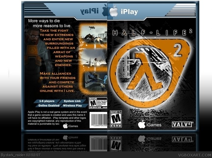
This was a project I was doing for my graphic arts class, I think it turned out pretty good so I decided to submit it. I know nothing about Half-Life but I took a shot at it anyways.
#9 you gave me a 4.5 because there is no spine, that is a pretty sad excuse, have you not seen most of the boxes on this site. IMO the boxes that are 2d, no spine with a reflection are the better than 3d with a spine.
Pretty good, nice setup however the iPlay template is pretty bad and the front chops off too much of the back. The M logo looks slightly large, but I won't countdown for it.
 Half-Life 2 Box Cover Comments
This was a project I was doing for my graphic arts class, I think it turned out pretty good so I decided to submit it. I know nothing about Half-Life but I took a shot at it anyways.
[ Reply ]
P.S. View in large view for HI-RES.
[ Reply ]
aw man you kick the crap out of mine.
[ Reply ]
Wow your improvement is staggering.
Incredibly artistic 5/5.
[ Reply ]
thanx.
[ Reply ]
awesome 5/5
[ Reply ]
i think the text on the back is a littel too big, and i wish they werent overlapping---even though the transparency looks cool.
[ Reply ]
I wanted it to overlap, so it could be shown that the temp is transparent.
[ Reply ]
My only complaint is "where's the spine?" otherwise its awesome. i especially love the borders around the screen shots.
[ Reply ]
#9 you gave me a 4.5 because there is no spine, that is a pretty sad excuse, have you not seen most of the boxes on this site. IMO the boxes that are 2d, no spine with a reflection are the better than 3d with a spine.
[ Reply ]
Look offical 5/5
[ Reply ]
Pretty good, nice setup however the iPlay template is pretty bad and the front chops off too much of the back. The M logo looks slightly large, but I won't countdown for it.
4.5/5. Not bad.
[ Reply ]
5/5.
[ Reply ]
pretty cool.
[ Reply ]
Really cool, Don't know why this has no favs it's really good :)
[ Reply ]