Yes, because sometimes the upload function doesn't work with some boxes. I had it earlier with other boxes. But don't let this influence the rating or anything else. I do not do this to irritate anyone or something. I just can't upload a new version of DMC 5, on the other DMC 5 box. I hope you understand this!
The back is weird...Not in a bad way. What I mean is this:
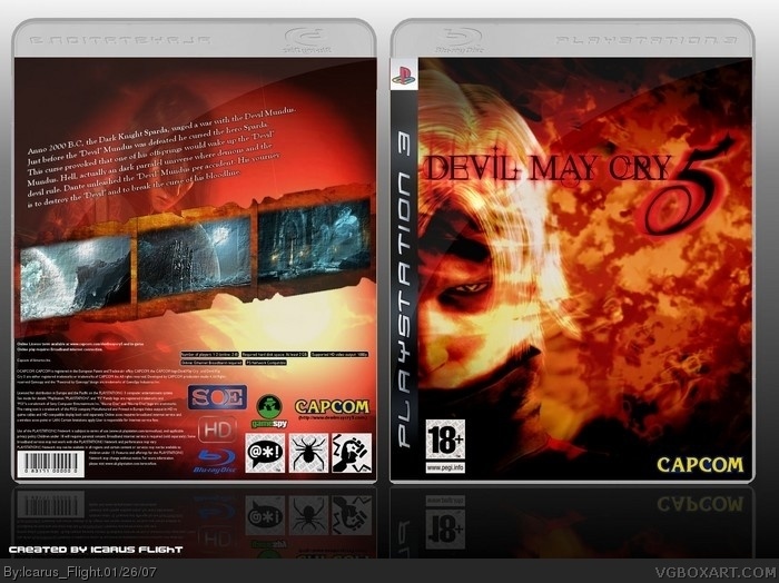
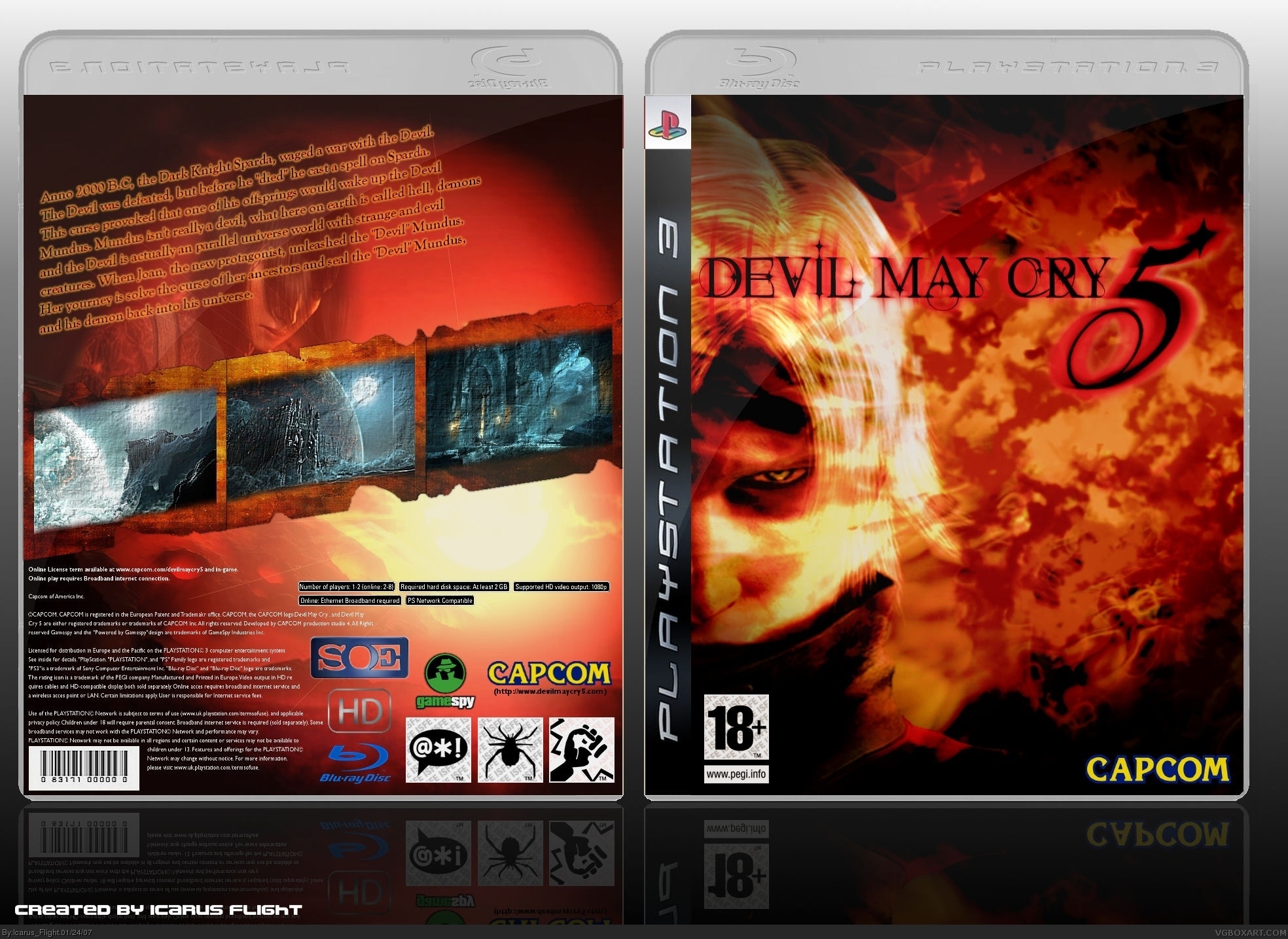
The back has everything a great back should. Pics, information, and the back template. But there's something about it that makes it feel laking. But since it DOES have everything that's needed, I give this a 5/5.
the whole thing is amazing with the exception of the synopsis. it looks great from a distance, but when you actually read it, its lacking and confusing.
Credit to Dead Pixels, why do you forget so much Icarus?
I agree with Wicked, the summary is a bit confusing, it says on the back the new protagonist is Joan but the front will mislead people into thinking it's Dante.
So it'd be alot more fitting there if the main character was Dante again and I personally don't like the whole paragraph of text at a disjointed angle.
Of course this is fantastic and I'm mega impressed by your work as always.
#17, dude I've you read the comments before you comment, They allready said that to me. It's missing something. I know! I'm working with material that has nothing to do with Devil May Cry 5, but I tried to make it look like a Devil May Cry Box!
This is amazing! How do you do these boxes TwilightMystics? 5/5. But I really dislike the fact that there were no screenshots that invole Dante pwning demons. Could you try posting a high quality version? The summary is a little confusing.
Awesome front cover mate! Really Cool.
But as few above mentioned... I think the back is a little plain. There's too much empty space IMO. It could do with a BIG tagline on the top... and some actual information of the game (features and/or sub-titles for the screen-shots). The slant text is okay.. but.. my thinking is, why have the text over the image of the girl when you have all that space on the right :) Oh.. add the title to the spine(s) too would look even better. ;)
 Devil May Cry 5 Box Cover Comments
Pfiew, so that finished. I hope you folks like it.
[ Reply ]
why did you had to upload it again .whill you can update this one link ?
[ Reply ]
Yes, because sometimes the upload function doesn't work with some boxes. I had it earlier with other boxes. But don't let this influence the rating or anything else. I do not do this to irritate anyone or something. I just can't upload a new version of DMC 5, on the other DMC 5 box. I hope you understand this!
[ Reply ]
Lover The Front But I Don't Really Like The Back It Feels Like It Is Missing Something IMO. But 4.5, But Im Not Gonna Vote Unless You Want me Too :D.
[ Reply ]
i think it looks amazing. as usual icarus.
5/5
[ Reply ]
What do I have to add to make it feel like that there isn't anything missing?
[ Reply ]
thanx Arcanus
[ Reply ]
The back is weird...Not in a bad way. What I mean is this:
The back has everything a great back should. Pics, information, and the back template. But there's something about it that makes it feel laking. But since it DOES have everything that's needed, I give this a 5/5.
[ Reply ]
#3, yeah i understand that but i think someone should tell Reed about this error cause it happened a lot ! anyways back to the box 5/5
[ Reply ]
the whole thing is amazing with the exception of the synopsis. it looks great from a distance, but when you actually read it, its lacking and confusing.
[ Reply ]
Credit to Dead Pixels, why do you forget so much Icarus?
I agree with Wicked, the summary is a bit confusing, it says on the back the new protagonist is Joan but the front will mislead people into thinking it's Dante.
So it'd be alot more fitting there if the main character was Dante again and I personally don't like the whole paragraph of text at a disjointed angle.
Of course this is fantastic and I'm mega impressed by your work as always.
[ Reply ]
Ow damnit, yeah I forgot, sorry. Credit to Deadpixels for his outstanding PS3 box.
And BTW much apriciated this comments.
[ Reply ]
I updated the text on the back!
[ Reply ]
#12, Sorry for bugging you, much better by the way 5/5.
[ Reply ]
Cool 5/5 .
[ Reply ]
The summary is a bit confusing, but everything else is awesome .
5/5
[ Reply ]
Really great front, but the back seems a little plain.
[ Reply ]
#17, dude I've you read the comments before you comment, They allready said that to me. It's missing something. I know! I'm working with material that has nothing to do with Devil May Cry 5, but I tried to make it look like a Devil May Cry Box!
[ Reply ]
This looks very offical 5/5
[ Reply ]
It number 1 now !!!
[ Reply ]
Credit to ShadySaiyin!
[ Reply ]
Cool looking temp.
[ Reply ]
wow.
[ Reply ]
4.5
[ Reply ]
Fucking amazing! o_O
I gave it a 4.5, which could've been a 5 if it wasn't for the bad quality of the logos (capcom, etc).
[ Reply ]
This is amazing! How do you do these boxes TwilightMystics? 5/5. But I really dislike the fact that there were no screenshots that invole Dante pwning demons. Could you try posting a high quality version? The summary is a little confusing.
Edited at 1 decade ago
[ Reply ]
Can I have the logo Twilight ?
[ Reply ]
I think I deleted it once....so I can't help. I can't it on my PC.
[ Reply ]
#28, rooo... I hate you :p lol
[ Reply ]
Awesome front cover mate! Really Cool.
But as few above mentioned... I think the back is a little plain. There's too much empty space IMO. It could do with a BIG tagline on the top... and some actual information of the game (features and/or sub-titles for the screen-shots). The slant text is okay.. but.. my thinking is, why have the text over the image of the girl when you have all that space on the right :) Oh.. add the title to the spine(s) too would look even better. ;)
[ Reply ]
great box,
how did you get the reflection of tthe box
[ Reply ]
great box,
how did you get the reflection of tthe box
[ Reply ]
#1, awsome! i MUST know what font you used!-GREAT JOB!
Edited at 1 decade ago
[ Reply ]