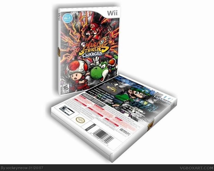
i) The logo on the spine is pretty unreadable to purchasers, rearrange the bits of the logo on the spine so it's in a straight line and made bigger.
ii) I don't like the 3D temp you used because I'm not a fan of having to adjust my neck to read it properly.
iii) The text on the back needs standing out a lot more with a drop shadow or whatever.
iv) The blue of the caption on the back clashes with the color scheme, change the color there.
Pretty good and better than your rest but still far from perfect 4/5.
 Mario Strikers Charged Box Cover Comments
wow that's fantastic! you've massively improved man!
[ Reply ]
credit to stardog for template. I wanted to try something different then amaray so i went with this hope you like it
[ Reply ]
AWSOME!!! 5/5
[ Reply ]
Very very good.
5/5
[ Reply ]
Perfect job! 5/5. Simply amazing.
[ Reply ]
Thanks for the fives guys I think this is my best box ever
[ Reply ]
5/5
[ Reply ]
Geez people need to be more observant.
Suggestions.
i) The logo on the spine is pretty unreadable to purchasers, rearrange the bits of the logo on the spine so it's in a straight line and made bigger.
ii) I don't like the 3D temp you used because I'm not a fan of having to adjust my neck to read it properly.
iii) The text on the back needs standing out a lot more with a drop shadow or whatever.
iv) The blue of the caption on the back clashes with the color scheme, change the color there.
Pretty good and better than your rest but still far from perfect 4/5.
[ Reply ]
4/5
[ Reply ]
#8, Exactly
[ Reply ]
#10 please don't bump sockey's old boxes. i'm sure he doesnt like it. i'm sure you don't *coughtherealsimturtlecough*
[ Reply ]
#11, Holy shit. Can a guy not catch a fuckin' break? I thought we were on good terms, man! What did I do now?
[ Reply ]
great job. this is the greatest mario boxart i've ever seen
[ Reply ]
Here is the official Euro-Boxart link
[ Reply ]
you have to click on the news "mario stricker chraged football" link
[ Reply ]
I feel really sorry for this guy, so many 5/5, but no favs.
[ Reply ]