I really like the front, the back feels a bit generic imo. (compared to the front) I'd suggest to move the tagline next to the head (instead of overlapping it) make the font size of the synopsis quite a bit smaller and bolder, than it creates space beneath it, to move the screens upwards (so they're not sticking to the bottom of the print)
Than you could try to add a small line of legal info and some logos at the bottom of the back, to make it more of an xbox cover rather than a misc. looking cover.
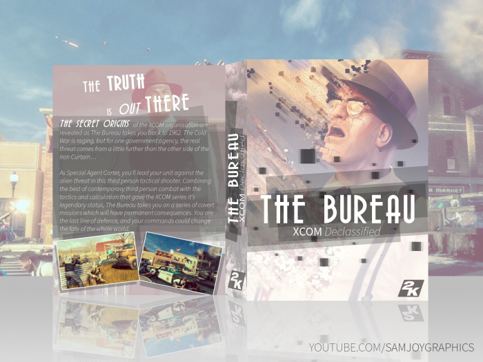
 The Bureau: XCOM Declassified Box Cover Comments
Not a fan of this game , but this is great , specially front ,
[ Reply ]
Like Front,Really Great . . .
[ Reply ]
I really like the front, the back feels a bit generic imo. (compared to the front) I'd suggest to move the tagline next to the head (instead of overlapping it) make the font size of the synopsis quite a bit smaller and bolder, than it creates space beneath it, to move the screens upwards (so they're not sticking to the bottom of the print)
Than you could try to add a small line of legal info and some logos at the bottom of the back, to make it more of an xbox cover rather than a misc. looking cover.
[ Reply ]
Agreed, the front is amazing
[ Reply ]
Front looks really great, but the back is too random IMO. Try to spice things up by adding quotes or cool implemented renders.
[ Reply ]
thanks everyone :)
[ Reply ]