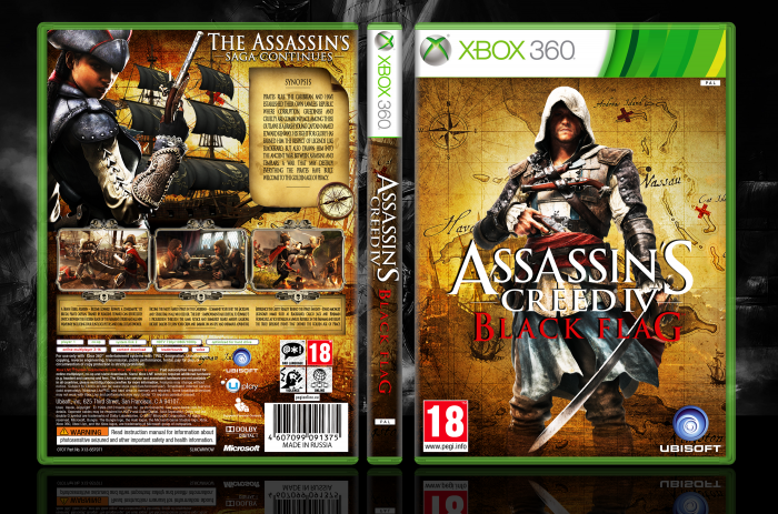
Updated the front Assassin’s Creed 3
[ Box updated on August 14th, 2013 ] [ original ]
 Assassins Creed IV: Black Flag Box Cover Comments
Comment on fergana16's Assassins Creed IV: Black Flag Box Art / Cover.
Wow , 3 AC4 Cover in 5 hours , just Wow , and this is so great , o_O
[ Reply ]
thx
[ Reply ]
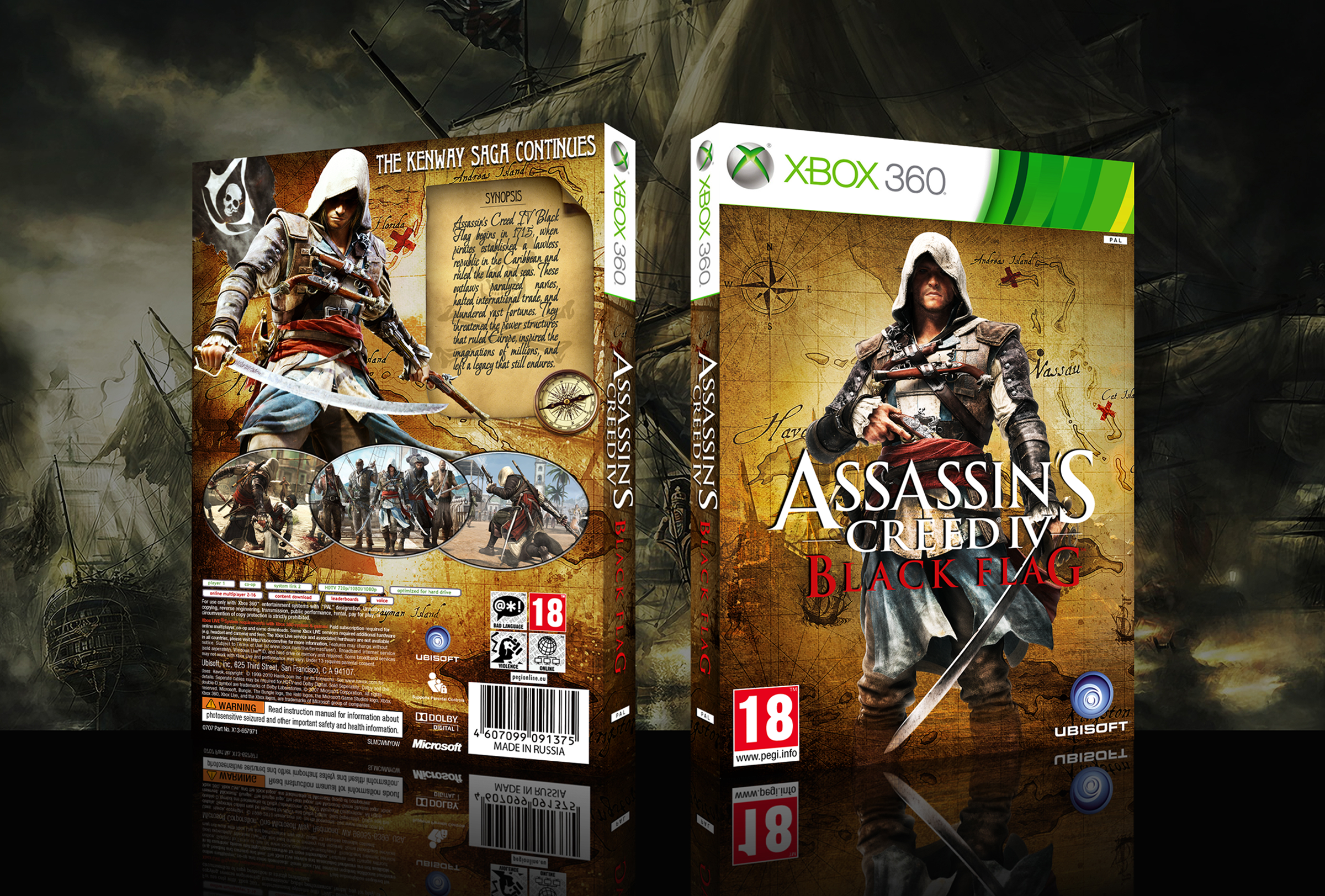
I really like the map background and the renders are well placed. I also like that you've tried something different with the screenshots, but It doesn't really fit in with the theme imo. (they look far to clean for my taste, a more worn-out look would work out better).
The tagline doesn't really make much sense to me? isn't this the first AC game starring Kenway :/ anyway, I think you could have chosen a more fitting font for the header (for example, the one you've used for the synopsis)
The script font does fit in with the map theme, but I'd suggest to only use script-like fonts for headers and not for a synopsis. Other than these things, it's a really nice looking box ;)
[ Reply ]
You could debate about it being the first game to star Kenway. IMO, though, it's really the second game, because Haytham and Connor both feature more play-time than Desmond.
[ Reply ]
I guess you're right (as 'Edward' is the father of 'Haytham' after all) but something like 'The Assassin's Saga Continues' sounds a bit more appropriate to me, that's all ;)
[ Reply ]
@Bastart Slogan taken from the box of Ausman101 as it short. If you believe the description of the game we are talking about captain Edward Kenway… Edward Kenway - Main character!
Font ( synopsis) is too thin for the slogan. You can try lettering logo/ TrajanPro-Regular/ its use in the description of. Screenshots tried various options. Probably will use your idea , and thanks for your comment Bastart.
[ Reply ]
@fergana16 I know the story is all about the Kenway ancestors, but to me it's a bit to soon to call it a Kenway saga :/ (as you play as an Abstergo research analyst that explores the story of 'Edward Kenway' and not as Desmond, that doesn't seem to play a major part in this game)
Haythem didn't really had a big playthrough in AC III, so saying the 'Kenway' saga continues' doesn't really seem appropriate to me (it's more like a 'start' on a new chapter' in a different kind of setting and era, rather than a 'continuation of a saga') it was more called a 'saga' when you'd take a look at the connection between Ezio and Desmond (as it took place around several games in the same kind of setting and time period)
I don't want to start a whole discussion over it, but to me this game looks to take a different approach on Abstergo and revolves around a new kind of protoganist (if you'd compare it to the rest of the series, which followed the story of Desmond)
That's just my point of view on it ;)
and yeah, I think a different font choice would work better for the tagline, because the current font doesn't got that pirate feel to it ;)
[ Reply ]
Slogan replaced thank you. Screenshots seem to be normal in kind,but I don't like how I did.
[ Reply ]
@fergana16 Excellent update ;) the tagline sounds and looks much better with the matching font imo. I think the screenshot borders are quite an improvement over the others.
[ Reply ]
Thx. Final update back
[ Reply ]
I don't know what it is, but there is something bothering me about this box. Maybe it's the overused map in the background. Don't get me wrong, I can see the effort that went into this and it has a cool look & feel, but there is something off.
[ Reply ]
Fergana Good Man . . . Really Nice Box . . . (â—Žoâ—Ž)
[ Reply ]
I love Game
[ Reply ]
Good Work.
[ Reply ]
Thank you all for the comments
[ Reply ]
Good!
[ Reply ]
it is really superb bro . where are you from ? i want to trade your covers
[ Reply ]
excellent job dude make it printable
[ Reply ]
This is brilliant. Would love an XBOX One version and it'll be great to get a printable version aswell.
[ Reply ]