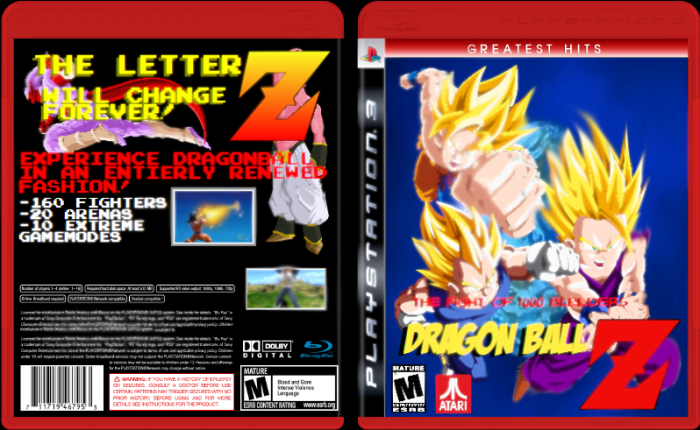
Things to do better:
You need better renders, they are too low-res. They are choppy and blurry. The background on the front is boring. The Mature Logo is a bit distorted.
The back has no concept, and the renders are overlayed by the letter Z.
The text has a boring font and looks displaced. The screenshots are blurry and displaced.
 DBZ 1000bleeders Box Cover Comments
Things to do better:
You need better renders, they are too low-res. They are choppy and blurry. The background on the front is boring. The Mature Logo is a bit distorted.
The back has no concept, and the renders are overlayed by the letter Z.
The text has a boring font and looks displaced. The screenshots are blurry and displaced.
[ Reply ]
Don't hate please.
[ Reply ]
That's just constructive criticism.
[ Reply ]
great improvement to the first box though.
[ Reply ]
@aldimon thanks im new to Photoshop anyway
[ Reply ]