The concept is fantastic even thought the execution could be greatly improved. Many of the images are blurry and/or slightly distorted. Otherwise, it's awesome.
I really like the colors and graphics on the box, it looks very nice! I noticed quite some issues though. The logo on the front, looks kinda boxed-in and out of porportion. The outerglow on the tagline, doesn't look very good imo. (it doesn't help with the readability either) The empty space on the back (where the legal info normally goes) kinda bugs me :/ maybe move the barcode to that space? It's also kinda weird as there is a M rating on the back and it's missing on the front?
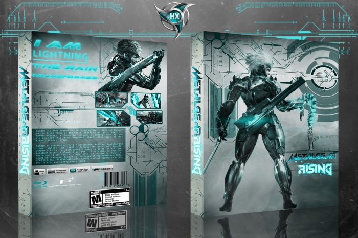
 Metal Gear Rising: Revengeance box cover Box Cover Comments
Good Job . . .
[ Reply ]
nice
[ Reply ]
The concept is fantastic even thought the execution could be greatly improved. Many of the images are blurry and/or slightly distorted. Otherwise, it's awesome.
[ Reply ]
nice
[ Reply ]
I really like the colors and graphics on the box, it looks very nice! I noticed quite some issues though. The logo on the front, looks kinda boxed-in and out of porportion. The outerglow on the tagline, doesn't look very good imo. (it doesn't help with the readability either) The empty space on the back (where the legal info normally goes) kinda bugs me :/ maybe move the barcode to that space? It's also kinda weird as there is a M rating on the back and it's missing on the front?
[ Reply ]
You might want to change the box title without the 'Box Cover' in it :/
[ Reply ]
nice
[ Reply ]
THE COLOR IS SO SO PERFECT WELL DONE KING GFX
[ Reply ]
nice
[ Reply ]
very nice (fav'd)
[ Reply ]
nice
[ Reply ]
Look , you jumped in the Line , Keep this UP , o_O
[ Reply ]
thnx
[ Reply ]
Fantastic!
[ Reply ]