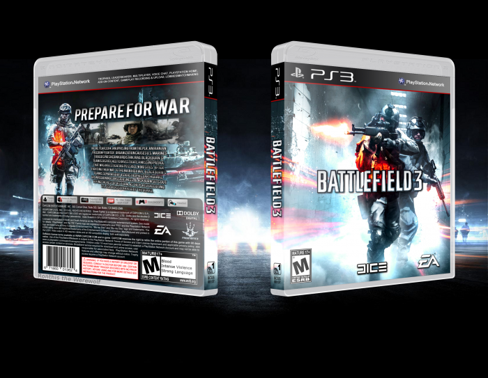
Neat box but doesn't really stand out from the rest BF3 boxes. Box uses same old blue color scheme and renders seen a million of times already. I'd suggest using more creativity and taking risks while making boxes for games like BF3. A simple color change and a more unique back layout could have made this box stand out more amid other designs.
 Battlefield 3 Box Cover Comments
Great...
[ Reply ]
Nice Work . . .
[ Reply ]
Nice Good Men
[ Reply ]
lolwut
[ Reply ]
@Ronthis the Werewolf hahahaha
[ Reply ]
I like it. The front looks a little bit uneven but still, it works somehow.
[ Reply ]
This is alright. Not a fan of the heavy dropshadow on the text on the back, but I dig the colors.
[ Reply ]
Looks great man! Very official
[ Reply ]
I like it. I'm with Martiniii on the dropshadow on the text, not too sure about the overly bright front too..
[ Reply ]
Neat box but doesn't really stand out from the rest BF3 boxes. Box uses same old blue color scheme and renders seen a million of times already. I'd suggest using more creativity and taking risks while making boxes for games like BF3. A simple color change and a more unique back layout could have made this box stand out more amid other designs.
[ Reply ]