Quite a lot to say about this on£%%**&%^&ERROR[1200a2]: SYSTEM IS COMPROMISED BY UNKNOWN FORCE. CToS IS REBOOTING...
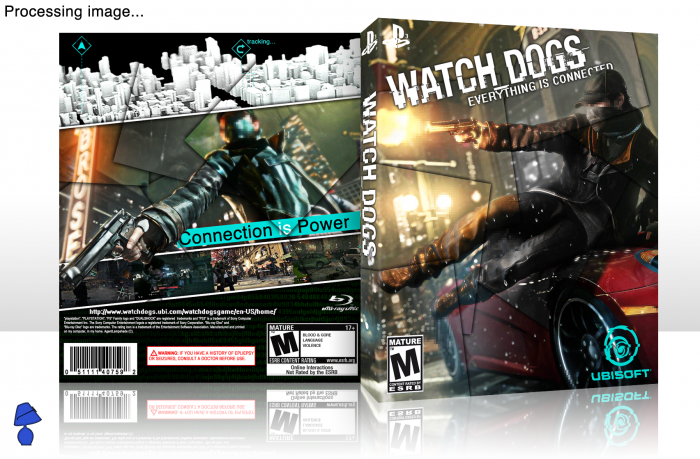
 Watch_Dogs Box Cover Comments
Comment on AgentLampshade's Watch_Dogs Box Art / Cover.
Quite a lot to say about this on£%%**&%^&ERROR[1200a2]: SYSTEM IS COMPROMISED BY UNKNOWN FORCE. CToS IS REBOOTING...
Comment on AgentLampshade's Watch_Dogs Box Art / Cover.
like it mate!!!!
[ Reply ]
btw, van you share the logo?? can't find the logo in google
[ Reply ]
It's on the resources section now.
[ Reply ]
@AgentLampshade
thx
[ Reply ]
Honestly....not a big fan of this. I usually am quite fond of your boxes but this seems out of place. I think the back looks like it was done by an amateur. The top of the back sticks out from the rest of the box that seems to be full of a lot of color. The squares all over look like it could be a good idea if done right but right now they are just random transparent rectangles all over. The screenshots kinda blend it too much to the top image so it looks like its part of it at first glance. Overall the back is a too messy and looks unfinished. The front is not bad but a little generic. It is good, just not as good as what you can do. Just my opinion though :)
[ Reply ]
Believe me, if there was more out for this game, it would be better but I had very little to work with (we don't even know the story yet.) I'm hoping to update this/make a better box once more info comes to light. Thanks for the honest critique. Very much appreciated.
[ Reply ]
@AgentLampshade Of course :) and yea you are right it is very hard to make a box for this game right now, but like i said you still did good for what it is :) ill be on the lookout for a new of this later on
[ Reply ]
Realy awesome...
[ Reply ]
Great stuff, glad you took my advice on the logo, looks really good.
[ Reply ]
This is really good man!
[ Reply ]
Nice Front O_o
[ Reply ]
considering the lack of material for this game..i think you did a really great job! when i saw the thumbnail i honestly thought this wouldn't be good, but i was wrong. I like how you used the squares to give the idea of everything being "connected". Well done =)
[ Reply ]
Nice one , o_O .
[ Reply ]
really great...
[ Reply ]
Thanks guys, glad this was well-received. I'm looking forward to seeing more of this game. It's ripe for conceptual boxes.
[ Reply ]
I like it very much. It has some "Syndicate" feel to it. I like the design with the squares. The front needs a stronger focus point imo. I think there's nothing "special to see" on the front. And the logo looks kind of boring. Nevertheless - great work there.
[ Reply ]