[ Buy Banjo-Threeie at Amazon ] By Ratchetcomand 8 on October 17th, 2006 No Printable Available [ Box updated on February 2nd, 2007 ] [ original ] Banjo-Threeie Box Cover Comments Comment on Ratchetcomand's Banjo-Threeie Box Art / Cover. Cancel Reply Ratchetcomand 8 [ 1 decade ago ] I hop you like it ! Sorry but the logo , it was the only spot where it didn't block the characters. [ Reply ] Ratchetcomand 8 [ 1 decade ago ] It looks better WITHOUT full view, but that's just me :) [ Reply ] treesquirrel12 5 [ 1 decade ago ] its good just a teensie weensie bit blurry the esrb is squashed and the logos are a bit big. if you can fix these tiny problems you are good to go. 4/5 until probs are fixed then 4.5/5 [ Reply ] Ratchetcomand 8 [ 1 decade ago ] For some reson this happens , it not burry on Photo shop I don't get it, but looks really crappy here... [ Reply ] Ratchetcomand 8 [ 1 decade ago ] #3 thanks , i fix it tommorw after school . Sorry bout the double post . [ Reply ] E_G 39 [ 1 decade ago ] link Credit to Totorou for the custom logo. Thats your line Ratchet, CMT may have stole it from that work and submitted on the box material thread but an honour still belongs to Titorou. [ Reply ] wii fan 1 [ 1 decade ago ] thats wat i was going to do but I IM SO BAD IN MAKING BOXS ARTS!!!! [ Reply ] Ratchetcomand 8 [ 1 decade ago ] #6 I thougth the logo was offical . Credit go to Totorou for the logo . Happy now . [ Reply ] wii fan 1 [ 1 decade ago ] but thats a good job! [ Reply ] Ratchetcomand 8 [ 1 decade ago ] UPGRADE !!! Credit to Crayon Man his temp . [ Reply ] blinkofeye 39 [ 1 decade ago ] Well it does look better with reflection but you should put black color down and white(grey) up [ Reply ] Ratchetcomand 8 [ 1 decade ago ] #11, Thanks i will fix that later. [ Reply ] Ratchetcomand 8 [ 1 decade ago ] Could the person who gave this a 1/5 tell what they think is wrong so i can change it??? [ Reply ] blinkofeye 39 [ 1 decade ago ] I think that it doesent have to do anything with your box, somebody is giving all good boxes 1 [ Reply ]

 Banjo-Threeie Box Cover Comments
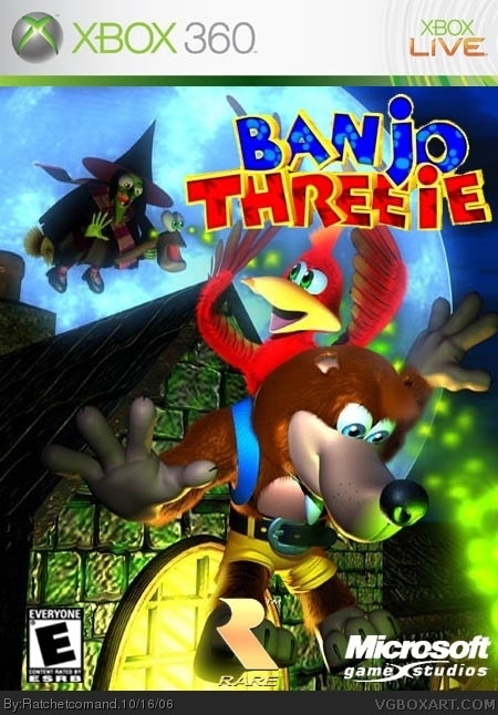
I hop you like it !
Sorry but the logo , it was the only spot where it didn't block the characters.
[ Reply ]
It looks better WITHOUT full view, but that's just me :)
[ Reply ]
its good just a teensie weensie bit blurry the esrb is squashed and the logos are a bit big. if you can fix these tiny problems you are good to go. 4/5 until probs are fixed then 4.5/5
[ Reply ]
For some reson this happens , it not burry on Photo shop I don't get it, but looks really crappy here...
[ Reply ]
#3 thanks , i fix it tommorw after school .
Sorry bout the double post .
[ Reply ]
link
Credit to Totorou for the custom logo.
Thats your line Ratchet, CMT may have stole it from that work and submitted on the box material thread but an honour still belongs to Titorou.
[ Reply ]
thats wat i was going to do but I IM SO BAD IN MAKING BOXS ARTS!!!!
[ Reply ]
#6 I thougth the logo was offical .
Credit go to Totorou for the logo .
Happy now .
[ Reply ]
but thats a good job!
[ Reply ]
UPGRADE !!! Credit to Crayon Man his temp .
[ Reply ]
Well it does look better with reflection but you should put black color down and white(grey) up
[ Reply ]
#11, Thanks i will fix that later.
[ Reply ]
Could the person who gave this a 1/5 tell what they think is wrong so i can change it???
[ Reply ]
I think that it doesent have to do anything with your box, somebody is giving all good boxes 1
[ Reply ]