![]() »
»
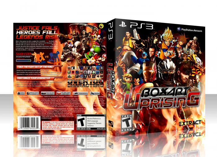
You all know I have been working on this for a while. For those I wasn't able to put on, 'Im sorry'. There is only so many people I can put on the front. Also I changed up some of the renders a few of you sent in to make them fit better on the box. Same character, different pose. Hope you all like it. I literally worked all Sunday finishing this up.
 Boxart Uprising Box Cover Comments
Comment on jevangod's Boxart Uprising Box Art / Cover.
So sexy. Also, I made the back! Yay!
[ Reply ]
Damn, nice work!
[ Reply ]
inb4 ohhhhh im not on here lol booooooo
I'm not on it and I don't even give a shit. It's an amazing box. :)
[ Reply ]
This is EPIC!
[ Reply ]
Very nice 9/10 would fav again
[ Reply ]
Haha nice.
[ Reply ]
*Been here 4 years*
*Searches for self on boxart*
;_;
[ Reply ]
I'm sure if you went to his WIP earlier and asked to be on the box he would have happily obliged, lol.
[ Reply ]
The proportions are a bit strange at places, and the Sackboy on the logo doesn't fit in well with the rest, at all, IMO.
Other than that, I can't find anything else that stands out in a bad way.
[ Reply ]
Hmm, I have mixed opinions on this one. The change in CGI renders and cartoon characters are abit off-putting and with the fire in the background it seems somewhat 'noobish' I'm not hating this, just have seen better from you.
[ Reply ]
The fire is a tad distracting on the back, but I still love this. The colours are perfectly balanced.
Also, I like where I am on the back :)
[ Reply ]
@ZombieDeadpool8 Yeah, I agree about the fire on the back, but it works out great on the front imo. your character looks badass indeed ;)
[ Reply ]
Like GrahamZ said, I feel like you should have stuck to either 2-D or CGI, not both. But it's not bad at all, you made it work to the best of your ability I'm sure. The box still looks real nice and clean, good work as usual Jevan.
[ Reply ]
:O
[ Reply ]
Needs more Watson.
[ Reply ]
I put you on it. Your the blue sonic silhouette on the back. Thought I would include you.
[ Reply ]
@jevangod Nice. ;D
[ Reply ]
This looks amazing. Fav.
[ Reply ]
Awesome job! I love it! <3
[ Reply ]
Wow! Amazing. so much characters, yet so nicely arranged.
Big thanks for including Bruticus ;)
[ Reply ]
Nice job, but where am I. gdhj
[ Reply ]
Your one of the silhouettes on the back.
[ Reply ]
@jevangod Ah, I see me now.
[ Reply ]
The characters here do a really good job of representing the newer members as well as the older members. I respect that.
[ Reply ]
Nice job, You are master on crowded design!
[ Reply ]
To be perfectly honest, I'm not really a fan.
When you include the extreme ends of the spectrum in character style, specifically notable seeing a 2D, hand-drawn Gambit behind an actual image of Daniel Craig, it's pretty jarring and messes with the consistency and flow of the design.
And while I'm sure it's difficult to create a cohesive design with a background that remains interesting without overcrowding the design, I've never really been one for the generic fire image. It's especially distracting on the back, where less ground is covered by various artworks.
As a VGBA-related project, it's pretty neat. But from a purely design standpoint, I'm not seeing it this time.
[ Reply ]
I see how you can think that. I think the same thing as the 2D. But I put that in the back of my head. I wanted this to be different. Just bring everything and everyone together. I wanted them all to have different looks and dimensions.
[ Reply ]
It has its faults, but i'm a sucker for these boxes! +fav
[ Reply ]
Is that Snake me?
[ Reply ]
Scorpion Soldier and you. There are many people with the same characters in their icon and I don't want to repeat.
[ Reply ]
Damn, I think that's the fasted HoF we've had here xD
Congrats, and nice work again!
[ Reply ]
HOF already? That was fast.
[ Reply ]
thats awesome, too bad i'm not on it, but thats fine
[ Reply ]
Just found my Conker. Great box!
[ Reply ]
WOOO! I didn't make it!
Anyway, awesome work man
[ Reply ]
Probably because your render was 2D. He did say only 3D or very similar.
[ Reply ]
omg I'm on there twice..... I feel special.
[ Reply ]
good work friend
[ Reply ]
I want a sequel.
[ Reply ]
lol. Maybe one day.
[ Reply ]