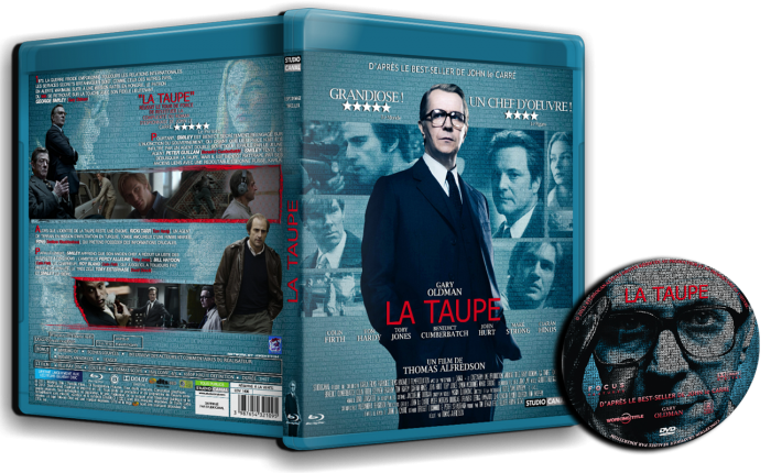
I really like the front, my only complaint is the text at the bottom is more of a back thing. As for the back I like the idea but I just don't think it works in terms of practicality, my main issue the the white text on the light background and I can't quite put my finger on if it's the font used or the typography of the text. Other than that though it's a very nice looking cover, the front almost looks official.
 La Taupe Box Cover Comments
it's different to other works...
[ Reply ]
A huge step up from your usual work. Great job.
[ Reply ]
Thanx
[ Reply ]
I really like the front, my only complaint is the text at the bottom is more of a back thing. As for the back I like the idea but I just don't think it works in terms of practicality, my main issue the the white text on the light background and I can't quite put my finger on if it's the font used or the typography of the text. Other than that though it's a very nice looking cover, the front almost looks official.
[ Reply ]
good :D
[ Reply ]