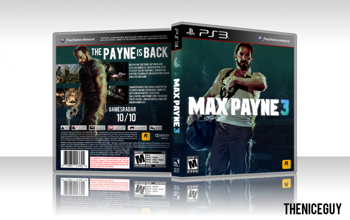
The back and color scheme look nice :) and work quite well.
The front looks a bit dull though (It's a bit static) Try to add something to the scene around Max or just look for a better/suitable image to use as front cover.
thanks, I wanted to keep away from the type of boxes I usually do, with lots of stuff on the front, and made this simple, so thats why the front is like that.
 Max Payne 3 Box Cover Comments
The back and color scheme look nice :) and work quite well.
The front looks a bit dull though (It's a bit static) Try to add something to the scene around Max or just look for a better/suitable image to use as front cover.
[ Reply ]
thanks, I wanted to keep away from the type of boxes I usually do, with lots of stuff on the front, and made this simple, so thats why the front is like that.
[ Reply ]