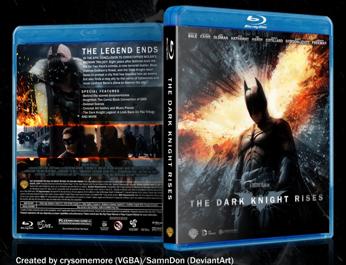
After a bunch of official marketing material came out, I decided to have a go at making an official looking Blu-ray case.
The front and back background pics are mostly in the style they were in from the get-go since I already liked how they were (e.g. not much was changed of the front pic aside from some cropping and logo adjusting) because like I said, I still wanted to keep an official feel to it. But I did add some effects and tweaked the coloring/lighting,
 The Dark Knight Rises Box Cover Comments
Comment on crysomemore's The Dark Knight Rises Box Art / Cover.
I like the back a lot.
[ Reply ]
I think this looks the most offical out of all the TDKR designs so far. Though it could do with some fixes here and there, I love the idea and concept of it. Nice Work!
[ Reply ]
Not bad. But like I said about the front (poster) when I saw it, it just doesn't look right. I mean, the angle on Batman is weird. Were looking straight up at the sky and yet Batman is at that angle. Plus its pretty much just the first poster they released just slightly edited. But I do love the back.
[ Reply ]
It's actually the latest official poster. The back is awesome.
[ Reply ]
Oh, it sounds like you knew that, sorry...
[ Reply ]
I agree, it's very official. I love it.
[ Reply ]
The back looks awesome ! +fav
[ Reply ]
dude. I've seen so many box art like this, but this is the best, by FAR!!!
[ Reply ]