![]() »
»
A huge thanks to everyone that helped me in the WIP thread: ZombieDeadPool8, stevencho, Patches, Backin5Minutes, Hackmaster6000, Shoul, Bastart, mark_inou, slimd1995, Throavium, deiviuxs, RunawayRed, Deividas, Higashi95, and Leegion. A big thanks to Pleiades for this fantastic template and mark_inou for the logo.
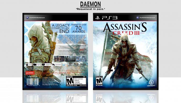
I realize it's a bit soon to post a box for this, and all of the information on the back is false, I am unsure if any of it is true.
Thanks for viewing and leave me a comment if you like it.
 Assassin's Creed III Box Cover Comments
Comment on Daemon's Assassin's Creed III Box Art / Cover.
I love it. I'm glad you used the screens I found for you, it really brings the box together. Like I said, excellent job mate!
[ Reply ]
Looks awesome!
[ Reply ]
Too contrasted for me.
[ Reply ]
I am not a huge fan of the color of the guy on the back. But I do like all of the other colors. Great work with such limited resources!
[ Reply ]
Nice, came out great.
[ Reply ]
The contrast on front image may be a bit too strong, but everything else is great. Wonderful work, man.
[ Reply ]
I can almost freeze because of the art XD
[ Reply ]
The front image reminds me of Skyrim, just the posture of the character is reminiscent of the one where Dragonborn is standing on a rock as the dragon tail wraps around him.
Anywho, love the design and it's great for what little resources you had.
[ Reply ]
Awsome !
PS : Look into your private message box in the forum, I gave you a usefull link for the synopsis !
[ Reply ]
Very very very cool, Great job!
[ Reply ]
It's decent for being the first AC3 cover, limited resources and all, but the various elements of the cover don't come together, in my eyes.
The transition from the mountain scenery to the Animus backdrop (specifically in the upper left corner of the front), is abrupt and I'm not sure the blurring on the edge is helping. Something more gradual, or having the Animus lines overlay the scenery, would be better. The logo is also somewhat distorted. I imagine it would be simple to create a high-res logo, if an official one isn't available.
As for the back, the layout could work, but it's executed in a way I find a bit bland. As a whole, it's really text heavy, and the black/blurred banners behind the text aren't incredibly appealing, partly due to the already simple image used as a background. I'm not sure the blurring was even necessary.
[ Reply ]
Good job. I applaud you making such a great box with few resources.
However, the contrast is a bit high.
[ Reply ]
Gorgeous!
[ Reply ]
Another great box!
[ Reply ]
great...
[ Reply ]
Not sure how I missed this...
Great job!
[ Reply ]
Well shit. Thanks, guys.
[ Reply ]
Wow this is awesome!!!
Can you make it 3D?
[ Reply ]