The large blocks of text work pretty well in the comic-book environment. I'd suggest adding some splatter-like effects, or maybe halftone, to fit better with the style established by the main logo as well as the screenshot borders.
There's little I can say about the front. Like you said, it's the official only with a template change, and not one I'm particularly fond of.
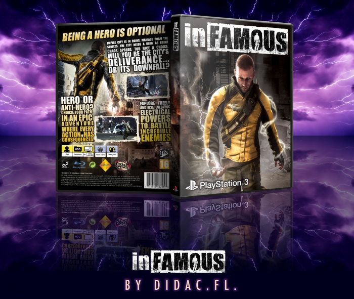
 inFAMOUS Box Cover Comments
It is the original cover art with minor changes.
[ Reply ]
The front looks pretty generic but the back is really nice.
[ Reply ]
This.
[ Reply ]
The large blocks of text work pretty well in the comic-book environment. I'd suggest adding some splatter-like effects, or maybe halftone, to fit better with the style established by the main logo as well as the screenshot borders.
There's little I can say about the front. Like you said, it's the official only with a template change, and not one I'm particularly fond of.
[ Reply ]