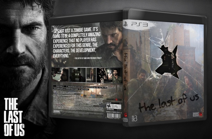
I really like the concept you're going for with this box,
but I think it could improve by making some changes.
The glass is a bit too dark imo. make is more see-trough
and the writing on the glass looks a bit childish (I know
you're going for an hadwritten font for the title, but I've
seen much better ones, that would be more fitting than
the font you've used at the moment)
The 'Naughty Dog' logo on the front is a bit to small imo.
Try making it a bit bigger in size and I'm missing a header
on the back of the box, not such a big deal though.
Very interesting. Great concept but like bastart said, could use some improving. The only gripe i have with it really is the back, its far too generic and the tagline/writing stands out way too much.
ps. PS3 template on the front looks very familiar.....(where the ps3 logo is) :p
Thans man, tagline on the back is officially and no changed at all.
PS3 logo on the front find as a png file on the net and brush under that make it myself.
I really like the concept behind this; but I don't like the subject behind the glass, it doesn't flow with the rest of the front. However this box definitely deserves more attention.
 The Last of Us Box Cover Comments
I really like the concept you're going for with this box,
but I think it could improve by making some changes.
The glass is a bit too dark imo. make is more see-trough
and the writing on the glass looks a bit childish (I know
you're going for an hadwritten font for the title, but I've
seen much better ones, that would be more fitting than
the font you've used at the moment)
The 'Naughty Dog' logo on the front is a bit to small imo.
Try making it a bit bigger in size and I'm missing a header
on the back of the box, not such a big deal though.
it sure got potential
[ Reply ]
Thanks man, Good advice :)
[ Reply ]
Very interesting. Great concept but like bastart said, could use some improving. The only gripe i have with it really is the back, its far too generic and the tagline/writing stands out way too much.
ps. PS3 template on the front looks very familiar.....(where the ps3 logo is) :p
[ Reply ]
Thans man, tagline on the back is officially and no changed at all.
PS3 logo on the front find as a png file on the net and brush under that make it myself.
[ Reply ]
@Majidblack
haha the ps3 brush stroke has been a part of my personal PS3 template for a while now. Thats all I was saying, and nothing wrong with it
[ Reply ]
@Deividas Yes i see that before on your art and like that idea. thanks for Understanding :)
[ Reply ]
Very good for what you had to work with.
[ Reply ]
Thanks of notice!
[ Reply ]
I like the idea.
[ Reply ]
I really like this one I don't know why it doesn't get more favs...
[ Reply ]
This is really your kind, thanks.
[ Reply ]
HOW GREAT THIS IS, MAN!!! gahhh! you just earned my respect!!! more power to awesome artists like you!!! :D
[ Reply ]
HOW GREAT THIS IS, MAN!!! gahhh! you just earned my respect!!! more power to awesome artists like you!!! :D
[ Reply ]
I really like the concept behind this; but I don't like the subject behind the glass, it doesn't flow with the rest of the front. However this box definitely deserves more attention.
[ Reply ]