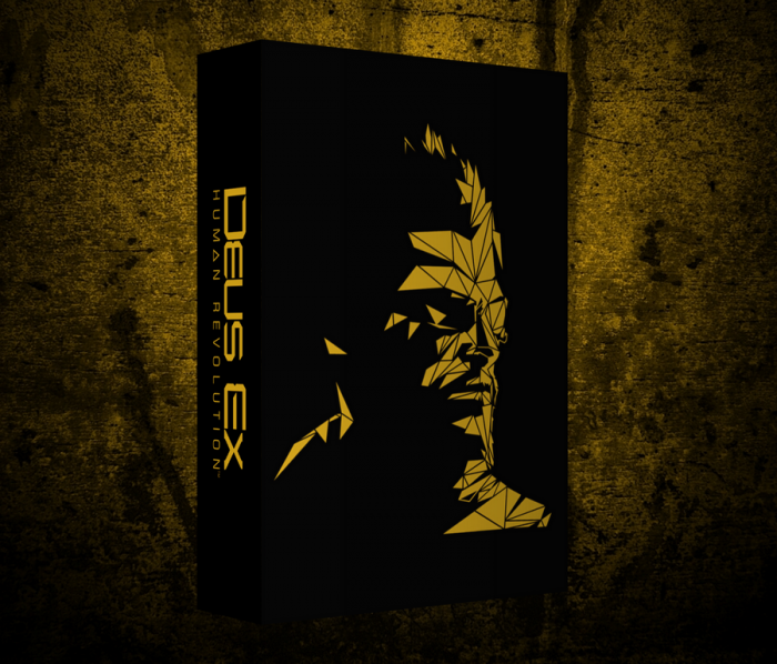
I'm glad that this cover exists and it's one of the best for me.I did a minor modification removing the front title and move it on the side of the box.Enjoy!
 Deus Ex : Human Revolution Box Cover Comments
Comment on sickhammer's Deus Ex : Human Revolution Box Art / Cover.
Game of the Year / Limited Collector's Edition / All DLC included / Behind the Scene make of the game content Box?
[ Reply ]
yes yes!
[ Reply ]
It looks good. the only problem is that its just a wallpaper. I cant really tell your ability or your potential in box-art design until i see a cover with a back and a front that you have designed. When do you plan on working on one? Im interested to see what you can do.
[ Reply ]
Please don't discourage minimalism. The number of assets used isn't important. The end result is what matters, and this looks great.
[ Reply ]
@Reed
Im not discouraging minimalism whats so ever. Im encouraging him to try and make his own minimalism idea. This is simply just a wallpaper put on a box. If he had made that wallpaper, then that is fantastic, but thats not the case. Not saying its bad at all, reason why I said it looks good.
[ Reply ]
@Reed thanks man
[ Reply ]
@Deividas the nex box art will be a big one to let the people see what i can do,i know that isn't a wow box art it's a simple one made in minutes but i like it,i post the box arts that i like and what i wanted to see from the original designers,most of them are minimal...
so stay tuned to see a full box art and after that i'll be back to my simple stuff for a while.
thanks for viewing,critics and everything!
[ Reply ]
@sickhammer
K sweet! I wasnt mocking or putting down this box at all by the way. Because it does look great the way it is. I just like to encourage you to really try and take your skills to a different level and see what you can do :) And minimalism is always good, im a fan of it
[ Reply ]
@Deividas thanks man,appreciate it trust me... promise you'll like the next one
[ Reply ]
@Reed There's a difference between minimalism and just putting an official picture on the template. Yes, it looks good if a bit plain; but most of the credit goes to the devs for the composition of the art to start with. So the box looks good, but very little visible effort.
[ Reply ]
I, for one, am a big fan of your works and I can't wait to see your big project.
[ Reply ]
I agree, your work is very appealing. Although I feel guilty, as the box doesn't involve THAT much effort. Keep up with the good work though. I look forward to seeing you create boxes with backs and more creative input.
[ Reply ]
I love this!
[ Reply ]
Well some of the i make them just for me and for fun,this are for a catalog i'm making for myself,ok from now on i will post full box arts with backs and stuff cause i don't want to dissapoint people here,i will work a lil bit minimalistic but not completely,hope the next will be a boom,just finished it,stayed up all night and it's arranged pixel by pixel trust me haha,thanks everyone for the feedback,criticism and opinions! Cheers to everybody!
[ Reply ]
Be as minimalistic as you like, it's just the soul of the box comes from the original artwork which you didn't create (or at least I assume, didn't edit that much).
Backs are more just for completeness, although they can sometimes compliment the front really well.
[ Reply ]
You did a great job, I actually ended up purchasing the collector's guide instead of the game because the collector's game had all the logos in the front, this is way cleaner and better. I don't know If I could request a printable version for a normal case ( meaning to have jensen and the title on the front like the collector's without all the logos, but for a normal case, as you said, generally all the design they did for this game is excellent, this one is my favorite). Great job!
[ Reply ]