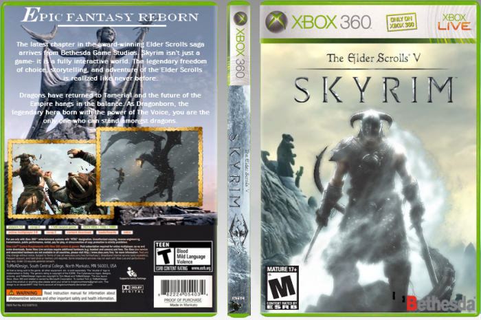
Deleted the first box 'cause the update feature wasn't working. Here ya go. My submission in the Midas Touch 2012 Round 1.
[ Box updated on January 11th, 2012 ] [ original ]
 The Elder Scrolls V: Skyrim Box Cover Comments
Comment on darthnater's The Elder Scrolls V: Skyrim Box Art / Cover.
This is actually not too bad. You have to remember a few things for the back. Try not to make everything so big. The screenshots and text should never take up the entire back. The logo is okay. The screenshot borders fit the game, but not this box in particular. Remember that you want everything to flow smoothly through the entire cover. Next time add some review scores, or special features or something like that on the back as well, it will help you keep everything smaller. But you are getting better and thats what I like to see
[ Reply ]
Thanks! I don't really like doing backs, but the original box had one, but I had to do it. This actually my first box messing around with lighting techniques, not just renders on a background. I have silver/gray versions of the screenborders. Should I use those instead?
[ Reply ]
@darthnater I think you should, they would look better than the golden ones. Although I disagree with Deividas regarding the back. I think the text is good and doesn't need scores or other stuff. But, I must agree that the screens are too big. I would like it better if it had 3 smaller ones. Faved ^^
[ Reply ]
I just noticed this is my first box of a "real" box. Yay.
[ Reply ]
Um...where did my comment go :(
[ Reply ]
It wasn't updating, so I deleted that box and posted this one.
[ Reply ]
@darthnater I worked hard on that comment :'(. It was like my own little word child....NYOOO
[ Reply ]
@madoublex There, there. They have to all go someday.
[ Reply ]