Well, I really wish I had more time to work on this, but I suppose there isn't any left. The theme of this round was story. Let me know how I did. Oh and check the printable, it's much better.
I personally hate all the text and all the red for the presentation and would recommend you cleaning it up and lowering the opacity a bit for the entire presentation part but I really like this box. The back does look a little rushed and empty and the writing on the back for the tagline is a little...too cartoonish and doesnt fit the box very well, still not half bad though for a rushed one. Def +fav for me
#2, The presentation was almost a COMPLETE rush, and I didn't try as hard as I could have. I still have one more day to update, so I'l definitely be changing the things you mentioned.
I like what you have for the front, despite it being a little generic due to the general layout and colors being the expected from this game. The way you setup the words does look good though. As for the back, I think this is where the box is lacking. Screenshots could use proper borders and show more about the game, and the text placement and font is rather odd. Not a bad job at all, but it could use some work.
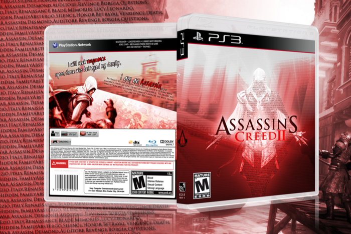
 Assassin's Creed II Box Cover Comments
Well, I really wish I had more time to work on this, but I suppose there isn't any left. The theme of this round was story. Let me know how I did. Oh and check the printable, it's much better.
Edited at 1 decade ago
[ Reply ]
I personally hate all the text and all the red for the presentation and would recommend you cleaning it up and lowering the opacity a bit for the entire presentation part but I really like this box. The back does look a little rushed and empty and the writing on the back for the tagline is a little...too cartoonish and doesnt fit the box very well, still not half bad though for a rushed one. Def +fav for me
Edited at 1 decade ago
[ Reply ]
#2, The presentation was almost a COMPLETE rush, and I didn't try as hard as I could have. I still have one more day to update, so I'l definitely be changing the things you mentioned.
[ Reply ]
Looks amazing. :)
[ Reply ]
I like what you have for the front, despite it being a little generic due to the general layout and colors being the expected from this game. The way you setup the words does look good though. As for the back, I think this is where the box is lacking. Screenshots could use proper borders and show more about the game, and the text placement and font is rather odd. Not a bad job at all, but it could use some work.
[ Reply ]