[ Buy Quake 5 at Amazon ] By LnknPrkDude 8 on September 26th, 2006 No Printable Available [ Box updated on September 26th, 2006 ] [ original ] Quake 5 Box Cover Comments Comment on LnknPrkDude's Quake 5 Box Art / Cover. Cancel Reply LnknPrkDude 8 [ 1 decade ago ] a man can dream cant he? lol, i made the logo myself, and used the quake 4 font to do the quake 5 text, background from caedes.net [ Reply ] LnknPrkDude 8 [ 1 decade ago ] made it a little bit better, made the outline green like in real life, and made the canvas smaller [ Reply ] epezent 1 [ 1 decade ago ] That's awsome! Nice logo, 4.5/5 [ Reply ] WickedGamer1 37 [ 1 decade ago ] thats absolutely awesome. the logo is great and the background is a very nice placeholder till theres some real material *crosses fingers* 4.5/5 its plain, and simple, and looks great. [ Reply ] Gunslinger 42 [ 1 decade ago ] WG1 pretty much summed up what i was going to say. *shakes fist* The only thing you may want to change is to make the title a bit darker. [ Reply ] LnknPrkDude 8 [ 1 decade ago ] will do sometime soon, thanks guys [ Reply ] LnknPrkDude 8 [ 1 decade ago ] decided to do some math...this got rated three time, two of which were 5's...the other rating was a 3.5...i just want to know what i did wrong [ Reply ] LnknPrkDude 8 [ 1 decade ago ] seriously, who are the cowards that are rating this a 3.5? just tell me what you dont like...it will only take 30 seconds out of your day [ Reply ] dark_raider 23 [ 1 decade ago ] pretty cool I really like how you did the logo. [ Reply ] werdney 5 [ 1 decade ago ] This is really nice. I love the logo. 4.5/5 [ Reply ] Radioactive Bob 38 [ 1 decade ago ] #8, lol, that's so true :P anyways, i like the logo and the background, while plain, is absolutly acceptible. 5/5 [ Reply ] LnknPrkDude 8 [ 1 decade ago ] thanks everyone [ Reply ] Ratchetcomand 8 [ 1 decade ago ] Awesome looks offical . To bad there woun't be a Quke 5 due to the Bad reviews of Quke 4. 5/5 [ Reply ] Mist 37 [ 1 decade ago ] It looks good but it seems to be missing something, I don't know what but something... 4/5 P.S.: A back would be cool! [ Reply ] Ratchetcomand 8 [ 1 decade ago ] I aree there something missing like the activson logo . A back would be cool as well . [ Reply ] LnknPrkDude 8 [ 1 decade ago ] on the quake 4 box they didnt have the activision logo on the front, only on the back [ Reply ] Ratchetcomand 8 [ 1 decade ago ] A back would be cool . [ Reply ] LnknPrkDude 8 [ 1 decade ago ] ill get working on it...it will be tough, but im guessing it will be worth it [ Reply ]

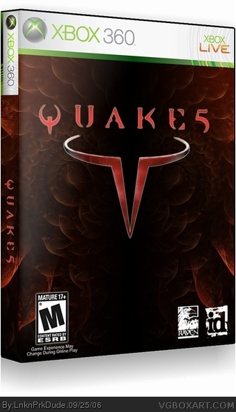
 Quake 5 Box Cover Comments
a man can dream cant he? lol, i made the logo myself, and used the quake 4 font to do the quake 5 text, background from caedes.net
[ Reply ]
made it a little bit better, made the outline green like in real life, and made the canvas smaller
[ Reply ]
That's awsome! Nice logo, 4.5/5
[ Reply ]
thats absolutely awesome. the logo is great and the background is a very nice placeholder till theres some real material *crosses fingers*
4.5/5
its plain, and simple, and looks great.
[ Reply ]
WG1 pretty much summed up what i was going to say. *shakes fist* The only thing you may want to change is to make the title a bit darker.
[ Reply ]
will do sometime soon, thanks guys
[ Reply ]
decided to do some math...this got rated three time, two of which were 5's...the other rating was a 3.5...i just want to know what i did wrong
[ Reply ]
seriously, who are the cowards that are rating this a 3.5? just tell me what you dont like...it will only take 30 seconds out of your day
[ Reply ]
pretty cool I really like how you did the logo.
[ Reply ]
This is really nice. I love the logo. 4.5/5
[ Reply ]
#8, lol, that's so true :P
anyways, i like the logo and the background, while plain, is absolutly acceptible. 5/5
[ Reply ]
thanks everyone
[ Reply ]
Awesome looks offical . To bad there woun't be a Quke 5 due to the Bad reviews of Quke 4.
5/5
[ Reply ]
It looks good but it seems to be missing something, I don't know what but something... 4/5
P.S.: A back would be cool!
[ Reply ]
I aree there something missing like the activson logo . A back would be cool as well .
[ Reply ]
on the quake 4 box they didnt have the activision logo on the front, only on the back
[ Reply ]
A back would be cool .
[ Reply ]
ill get working on it...it will be tough, but im guessing it will be worth it
[ Reply ]