#1: A movie poster feel was what I was going for, on the front anyways. Thanks for the Struzan comment, that was nice to hear.
#2: Far too early to tell. I'm sure others will be submitting their own covers before the 19th.
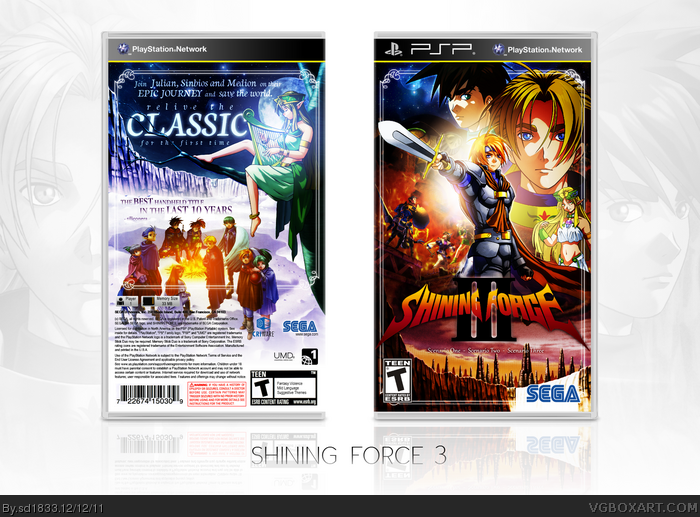
I recreated a few pieces of artwork for this, decent resources that aren't blurry or faded are hard to come by for this game. I wanted the front to be action-packed and, like Eggboy mentioned, almost laid out like a Struzan poster. While the back I wanted to keep simple and refined, hence the lighter, colder color scheme.
#4: I tried squeezing some screenshots into the layout, but they looked very out of place. I decided to stick to text rather than go out of my way to implement something that wasn't working.
Thanks for dropping by with a comment though. Much appreciated!
There go my chances for even getting second place in the comp!
Damn you for being this good, but honestly this is great, and now I understand why I vaguely recognized the image you posted in the forums. XD
Kudos on the presentation over all, and like everyone else has stated thus far, the action poster feel for the front is very attractive and well presented. I'm also liking the calming and simplistic feel for the back, it reminds me of the back of the PSP port of FF Tactics: WotL.
Btw did you use the same mountain wall on both the cover and the back?
#7: No need to say that, and I probably wouldn't have entered the competition if I already had a copy.
#8: Thanks much. I did use the same mountain, the lack of resources almost forcing me to lest I use art from a different game. I thought I'd changed it's appearance enough to go by undetected, so good eye.
#9: Thanks, as always, Aelixus.
#10: Thanks, and I'm looking forward to seeing that cover.
Nice cover, sd, as always. Your layout always amazes me, both the front and the back. The colors are nice but I fell they are a bit too strong and overpowering. Also, I don't know if this was intentional but front and back color scheme doesn't match too well.
Either way, this is still a pleasant piece of work to look at.
#12: Strong colors are my thing, but I understand if you're turned off by the strong saturation. And yes, the contrasting color schemes were intentional. Thanks much for leaving a comment.
#14: If I had a higher resolution for the front, I might have considered removing the template and printing it as a poster. Thanks for the feedback, del.
#15: Indeed, thanks to Daemon for shining some light on this. I appreciate it, and your comment, Deadpool.
 Shining Force III Box Cover Comments
Lovin' the Drew Struzan deal here. :D
Sexy colors, nice layout.
[ Reply ]
:'D
I think you won the mini comp. :)
Edited at 1 decade ago
[ Reply ]
Thanks, guys.
#1: A movie poster feel was what I was going for, on the front anyways. Thanks for the Struzan comment, that was nice to hear.
#2: Far too early to tell. I'm sure others will be submitting their own covers before the 19th.
I recreated a few pieces of artwork for this, decent resources that aren't blurry or faded are hard to come by for this game. I wanted the front to be action-packed and, like Eggboy mentioned, almost laid out like a Struzan poster. While the back I wanted to keep simple and refined, hence the lighter, colder color scheme.
[ Reply ]
Could use some screen shots to look more official, but it's very nice looking either way.
[ Reply ]
#4: I tried squeezing some screenshots into the layout, but they looked very out of place. I decided to stick to text rather than go out of my way to implement something that wasn't working.
Thanks for dropping by with a comment though. Much appreciated!
[ Reply ]
To me this is the best entry in the comp so far, it looks fantastic.
[ Reply ]
ANnnnnnnnnnnnnnnnnnnnnnnnnnnnd there goes any hope of me winning. Of course, if you have an extra copy of sonic generations lying around...
[ Reply ]
There go my chances for even getting second place in the comp!
Damn you for being this good, but honestly this is great, and now I understand why I vaguely recognized the image you posted in the forums. XD
Kudos on the presentation over all, and like everyone else has stated thus far, the action poster feel for the front is very attractive and well presented. I'm also liking the calming and simplistic feel for the back, it reminds me of the back of the PSP port of FF Tactics: WotL.
Btw did you use the same mountain wall on both the cover and the back?
[ Reply ]
:O Fantastic...
[ Reply ]
Yup, I really like this. I love the layout so much that it's inspiring me to create a similar "movie-poster" box.
[ Reply ]
#6: Thanks, that means a good deal to me.
#7: No need to say that, and I probably wouldn't have entered the competition if I already had a copy.
#8: Thanks much. I did use the same mountain, the lack of resources almost forcing me to lest I use art from a different game. I thought I'd changed it's appearance enough to go by undetected, so good eye.
#9: Thanks, as always, Aelixus.
#10: Thanks, and I'm looking forward to seeing that cover.
[ Reply ]
Nice cover, sd, as always. Your layout always amazes me, both the front and the back. The colors are nice but I fell they are a bit too strong and overpowering. Also, I don't know if this was intentional but front and back color scheme doesn't match too well.
Either way, this is still a pleasant piece of work to look at.
[ Reply ]
#12: Strong colors are my thing, but I understand if you're turned off by the strong saturation. And yes, the contrasting color schemes were intentional. Thanks much for leaving a comment.
[ Reply ]
This definitely needs more attention, this box is beautiful! I want the front blown up on a poster in my room
[ Reply ]
How the hell did I miss this? Credit Daemon for raising making me take notice of this wonderful, beautiful piece of art.
[ Reply ]
Fuck me, this is incredible!
[ Reply ]
#14: If I had a higher resolution for the front, I might have considered removing the template and printing it as a poster. Thanks for the feedback, del.
#15: Indeed, thanks to Daemon for shining some light on this. I appreciate it, and your comment, Deadpool.
#16: Thank you kindly, Ervo. :]
Edited at 1 decade ago
[ Reply ]
Awesome.
[ Reply ]
Damn, this is amazing! The typography on the back and composition on the front is just something else!
[ Reply ]
Hi man, This is awesome, Where are you ? I miss you a lot and your helpful comments ;D
[ Reply ]
...Is there really a PSP version of Shining Force 3??? O_O
[ Reply ]
It's about damn time this got HoF
[ Reply ]
Damn, I really did (do?) have a thing for high contrast.
[ Reply ]