I love the canvas feel you added to the whole box and everything seems to be cut out nicely. My only problems are that the screen borders look a little iffy and the extras you added seemed a little unnecessary. Another great work from you.
I'm not sure if you're still able to edit this or not, since you uploaded it a while ago, but I did spot some minor mistakes on your back.
+In your tagline there should be an apostrophe - "It's"
+For your blurb I think it would be better rewritten as:
"The Golden Sun series returns in a dark adventure where you will face off against ferocious monsters and beasts."
+Under features; I think it would have been better worded as "High replay value"
+Your legal info section is very low quality, I might suggest using Sarashi's DS template.
+I'd also like to suggest that you redo your cartridge, seeing as you placed the canvas texture ontop of it, making it look lower in quality, might I also suggest using a smaller title logo on it instead of the render of Alex.
Overall I still like this case a lot, I just wish that I had pointed this stuff out earlier.
Thanks for all the suggestions, I took your feedback and updated the box :), also credits to Ninty for his awesome template which can be found here: link
@Deathmania
Glad to see that you implemented all of my suggestions! XD
Although the reason I suggested you use Sarashi's temp was that this one states only Poke'mon info on it. (I actually used this one on my Yume Nikki box lol. I had to edit it so much, just to make it look normal, and I found out that the new barcode I had on it was for Mariokart DS XD)
And it might just be me nitpicking but the shadow border along the box seems kinda out of place/unneeded
I'm also going to have to side with Mtp on that it looks a little stretched/squished. Were you having issues aligning the box to the temp?
Overall great update!
(On a personal note I kinda miss the map; It made me nostalgic for GS#1 since I still have the map it came with! XD)
 Golden Sun: Dark Dawn Box Cover Comments
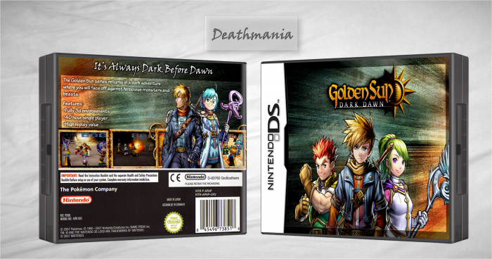
Here it is my Golden Sun box.
Credits to Ray Blade for the template and the borders.
As always remember to comment and fav.
[ Reply ]
Nice. But the cartridge isn't high quality and the picture looks out of place on it. Other than that, Its Great!
Edited at 1 decade ago
[ Reply ]
I love the canvas feel you added to the whole box and everything seems to be cut out nicely. My only problems are that the screen borders look a little iffy and the extras you added seemed a little unnecessary. Another great work from you.
[ Reply ]
I'm not sure if you're still able to edit this or not, since you uploaded it a while ago, but I did spot some minor mistakes on your back.
+In your tagline there should be an apostrophe - "It's"
+For your blurb I think it would be better rewritten as:
"The Golden Sun series returns in a dark adventure where you will face off against ferocious monsters and beasts."
+Under features; I think it would have been better worded as "High replay value"
+Your legal info section is very low quality, I might suggest using Sarashi's DS template.
+I'd also like to suggest that you redo your cartridge, seeing as you placed the canvas texture ontop of it, making it look lower in quality, might I also suggest using a smaller title logo on it instead of the render of Alex.
Overall I still like this case a lot, I just wish that I had pointed this stuff out earlier.
[ Reply ]
Thanks for all the suggestions, I took your feedback and updated the box :), also credits to Ninty for his awesome template which can be found here: link
[ Reply ]
@Deathmania
Glad to see that you implemented all of my suggestions! XD
Although the reason I suggested you use Sarashi's temp was that this one states only Poke'mon info on it. (I actually used this one on my Yume Nikki box lol. I had to edit it so much, just to make it look normal, and I found out that the new barcode I had on it was for Mariokart DS XD)
And it might just be me nitpicking but the shadow border along the box seems kinda out of place/unneeded
I'm also going to have to side with Mtp on that it looks a little stretched/squished. Were you having issues aligning the box to the temp?
Overall great update!
(On a personal note I kinda miss the map; It made me nostalgic for GS#1 since I still have the map it came with! XD)
[ Reply ]
Good, but looks squished.
[ Reply ]